An operational validation system has been developed to systematically assess the model outputs at daily, monthly and seasonal time scales. Multi-platform observations including satellite-derived products (Sea Surface Temperature and surface geostrophic currents) and in-situ measurements (Argo floats and fixed moorings) are used for this systematic validation.
Daily Sea Surface Temperature maps
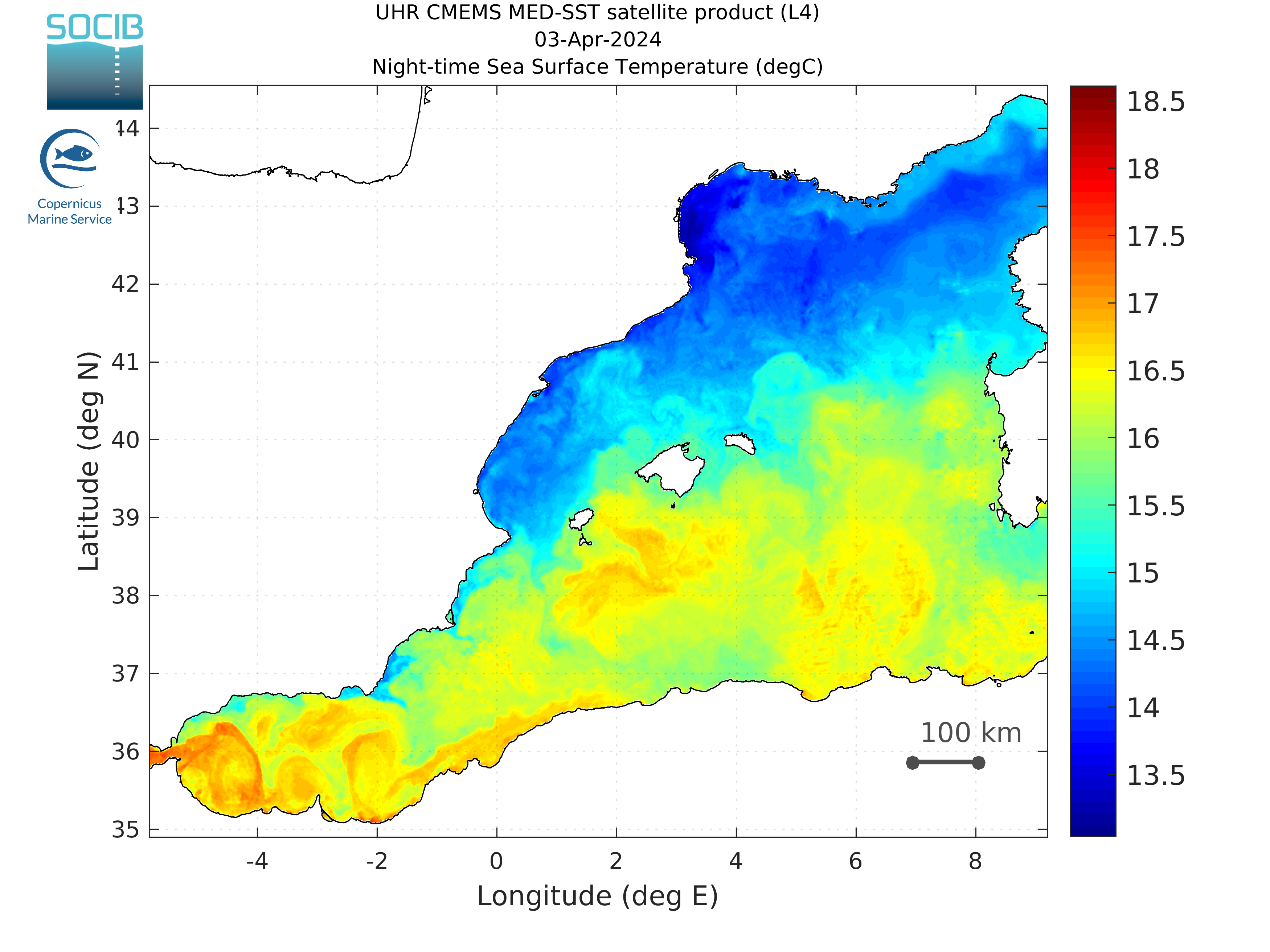
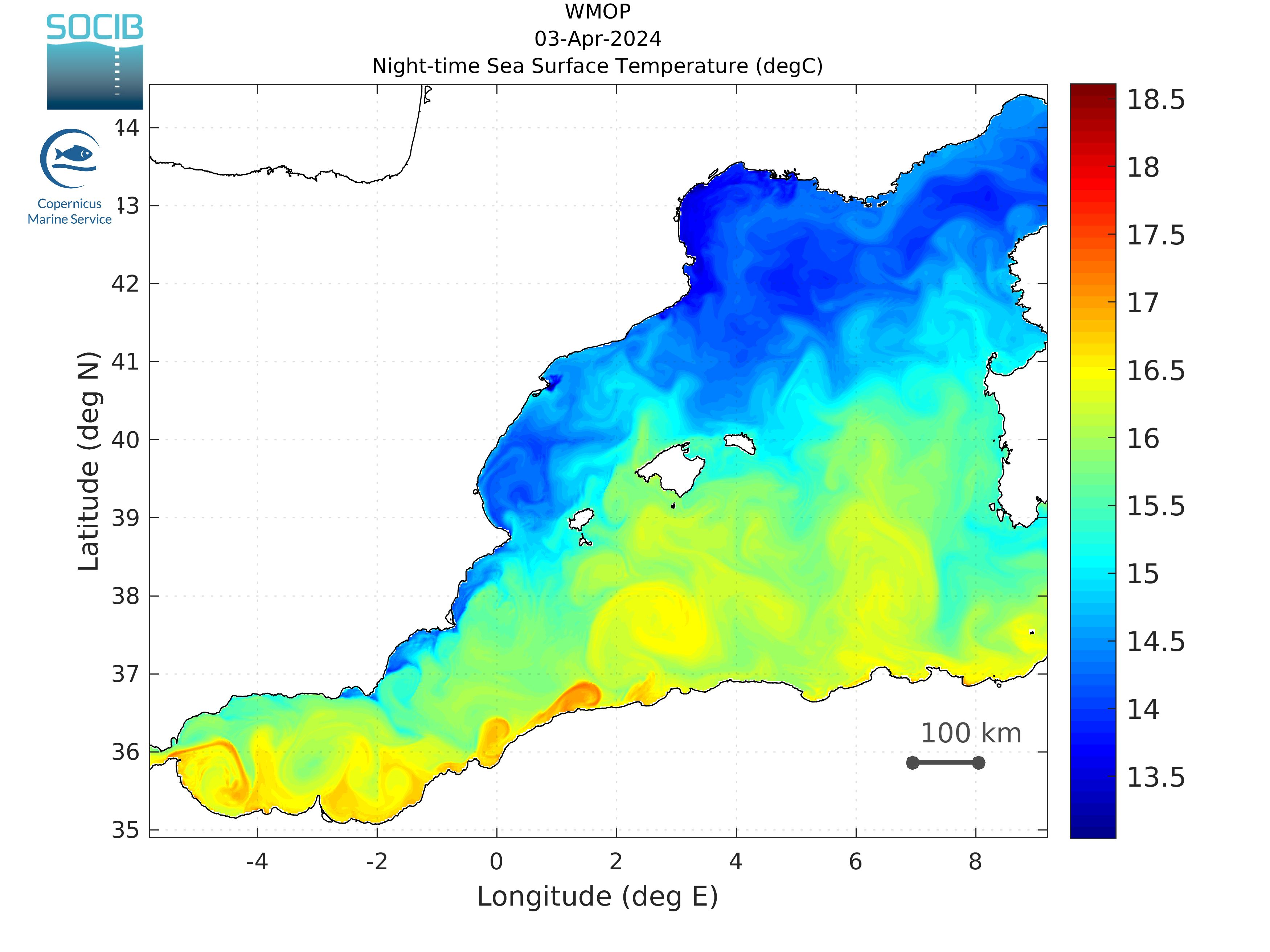
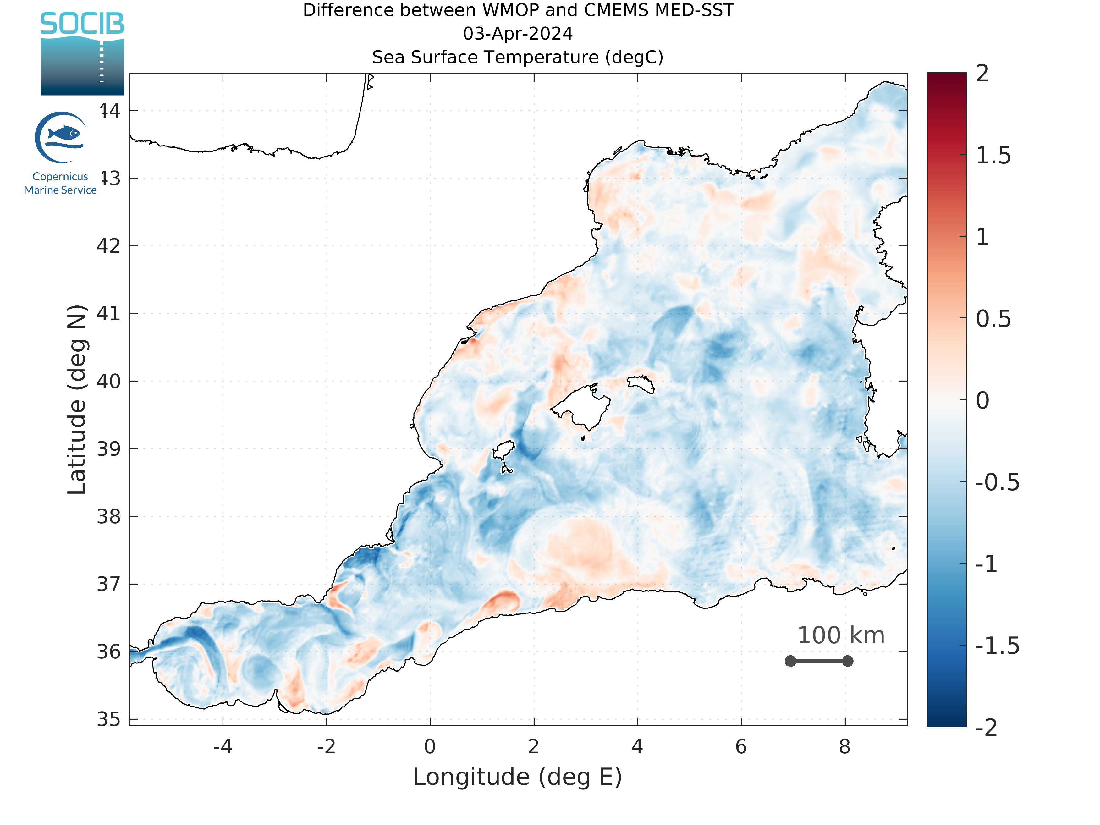
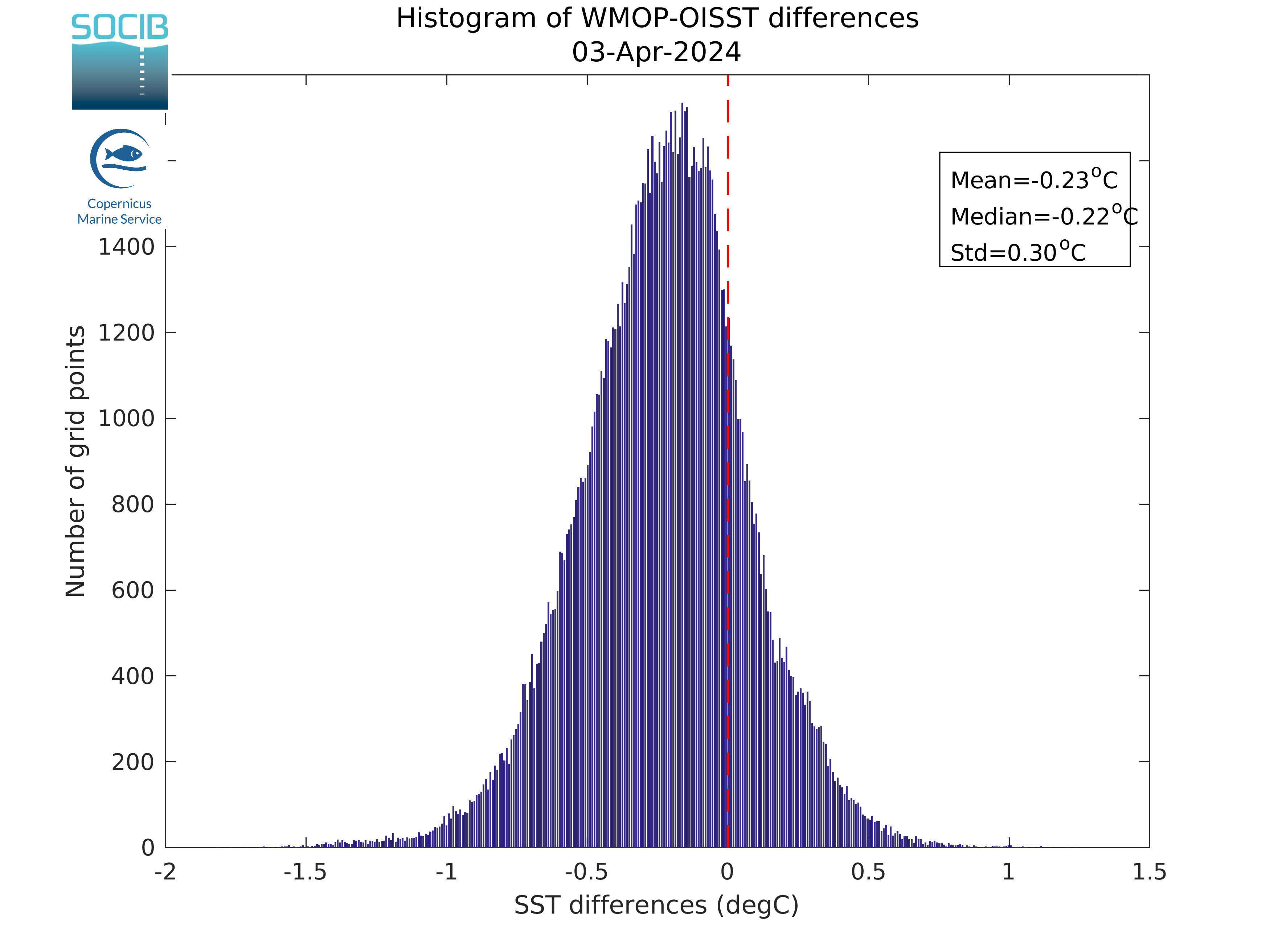
The WMOP SST is compared in this section to the last available satellite L4 SST product provided by GOS-ISAC-CNR and distributed by the Copernicus Marine Environment Monitoring Service.
|
|
|
| Figure 1: SST (satellite) | Figure 2: SST (WMOP) | |
|
|
|
| Figure 3: SST (WMOP) minus SST (satellite) | Figure 4: Histogram of SST (WMOP) minus SST (satellite) |
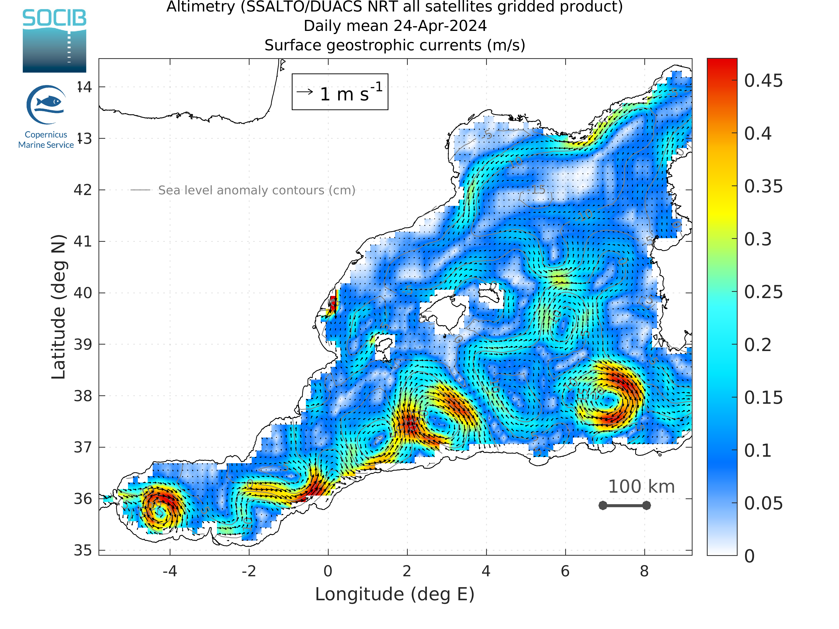
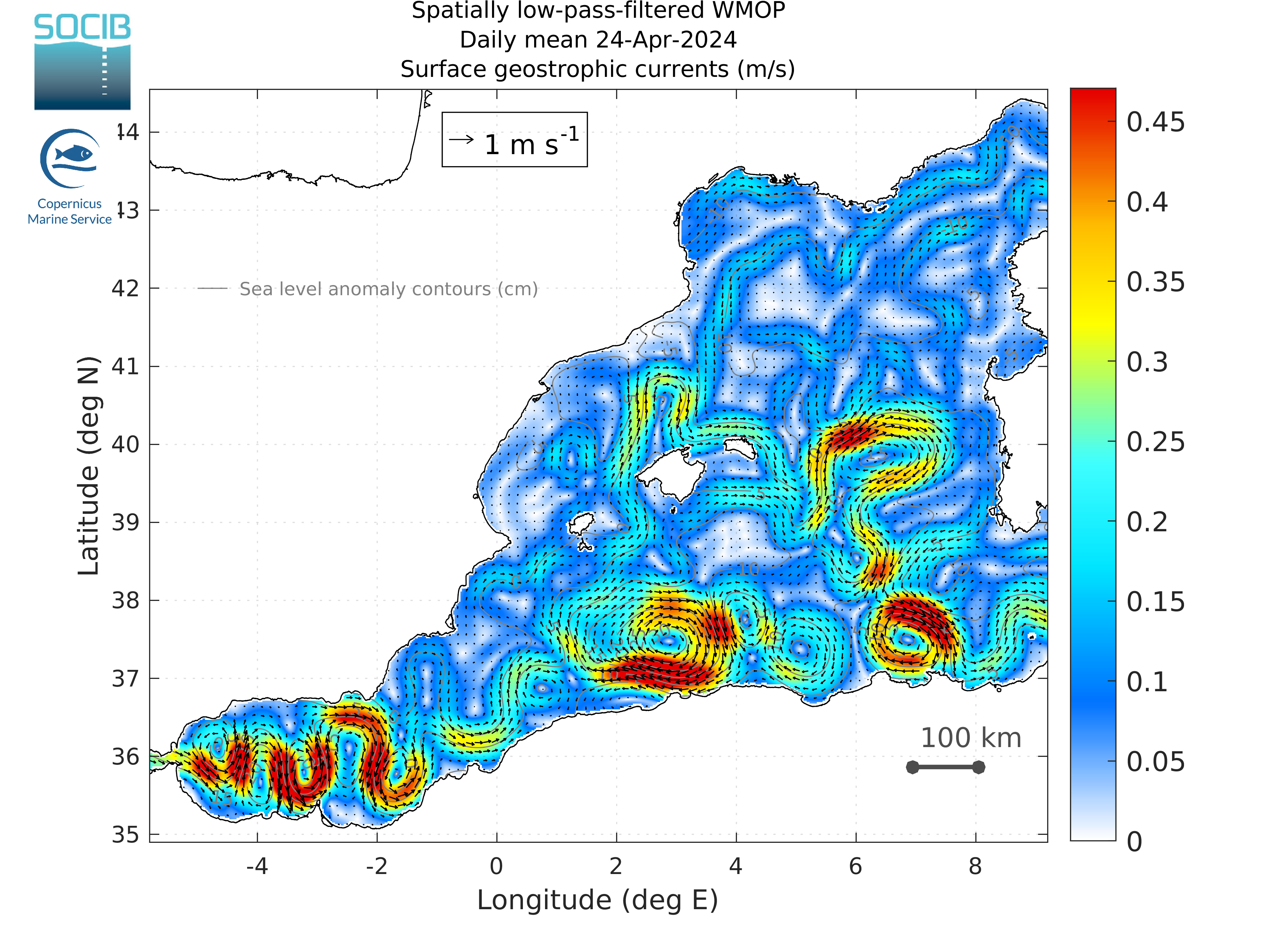
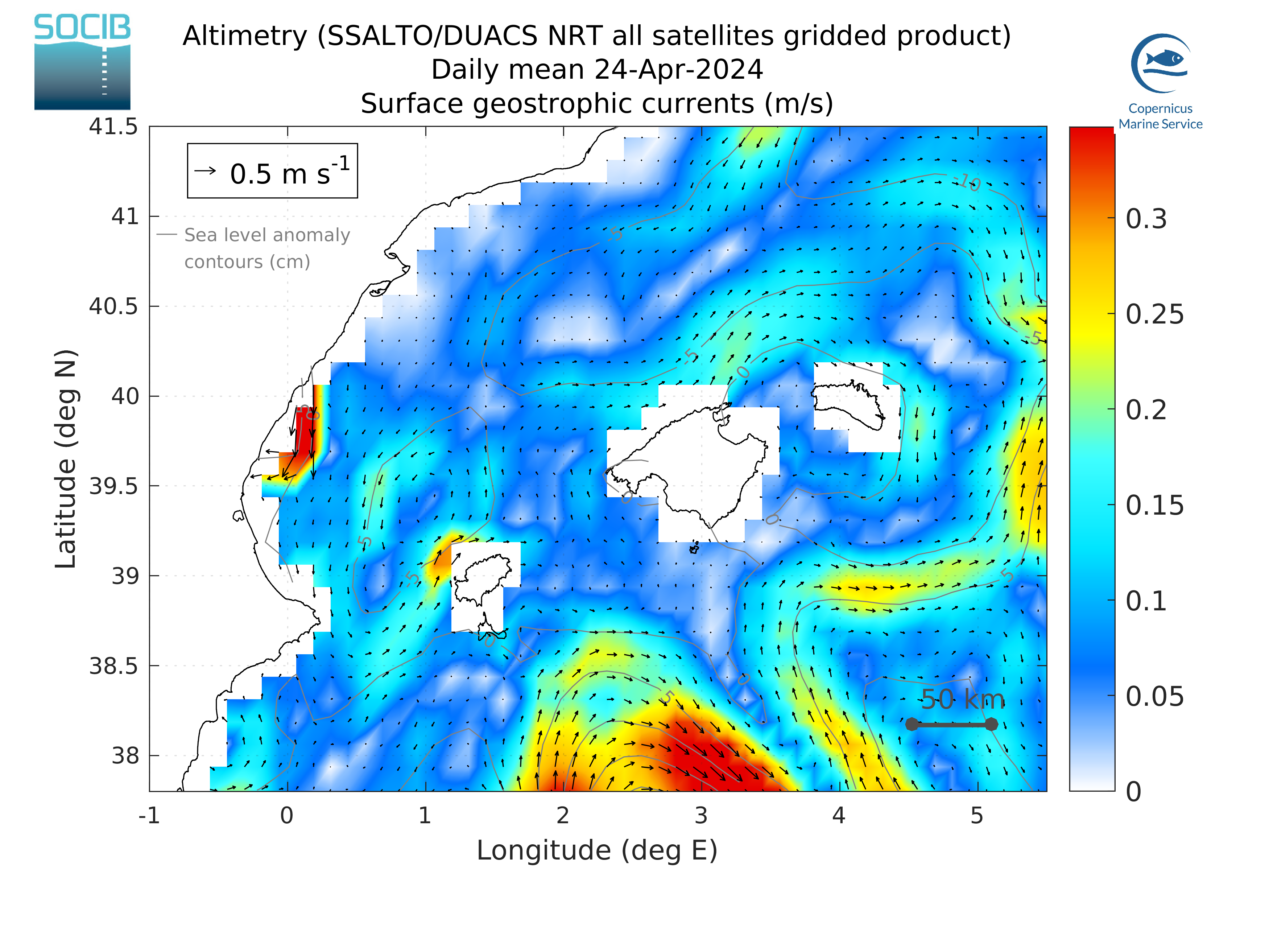
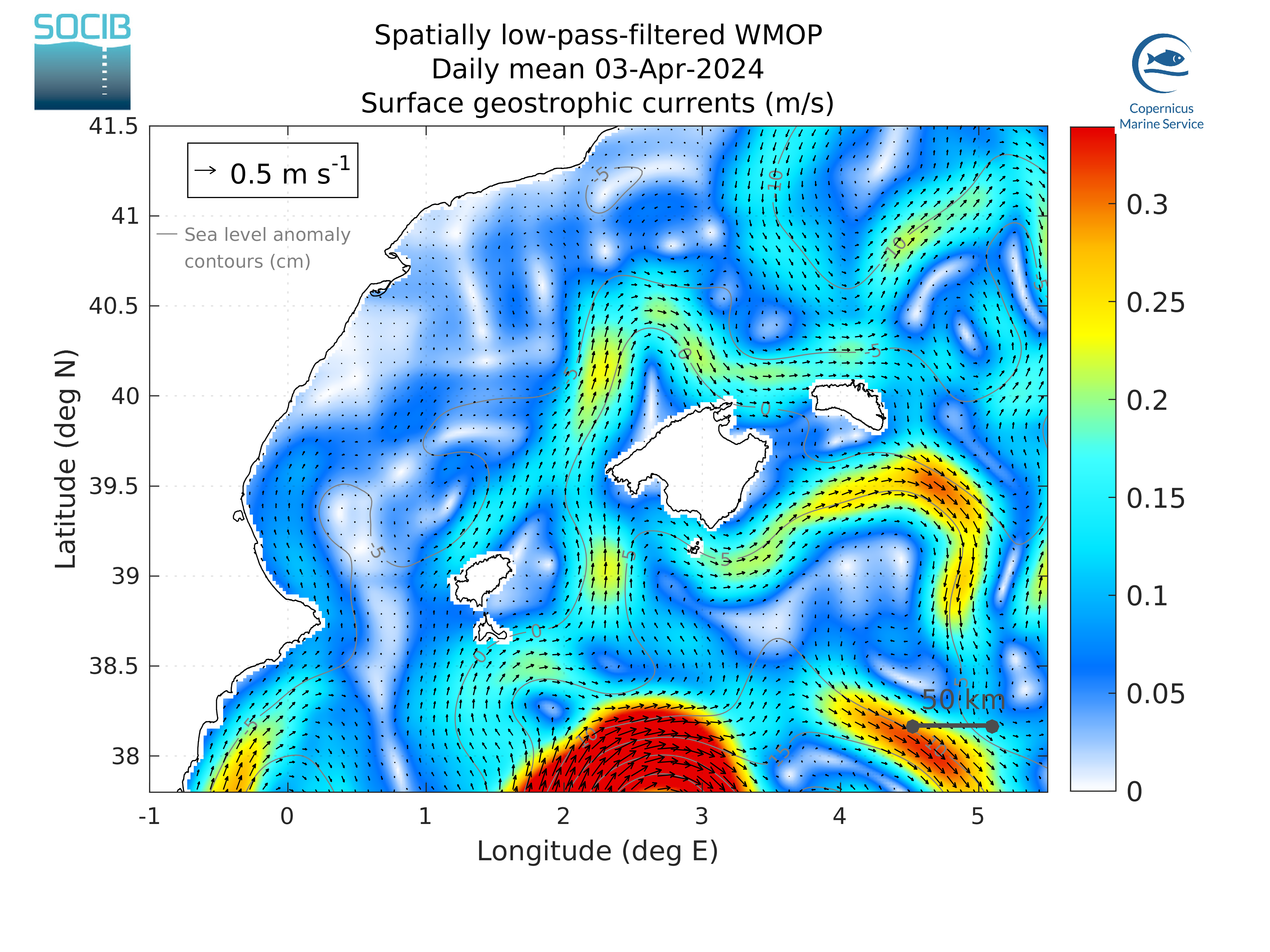
Daily surface geostrophic currents maps
The WMOP surface geostrophic currents are compared in this section to the last available surface geostrophic currents derived from the AVISO SALTO/DUACS Absolute Dynamic Topography altimetry product.
|
|
| Figure 1: AVISO surface geostrophic currents over the Western Mediterranean (m/s) | Figure 2: WMOP geostrophic sea surface currents (m/s) |
|
|
| Figure 3: AVISO surface geostrophic currents (m/s) in the Balearic Sea | Figure 4: WMOP surface geostrophic currents (m/s) in the Balearic Sea |
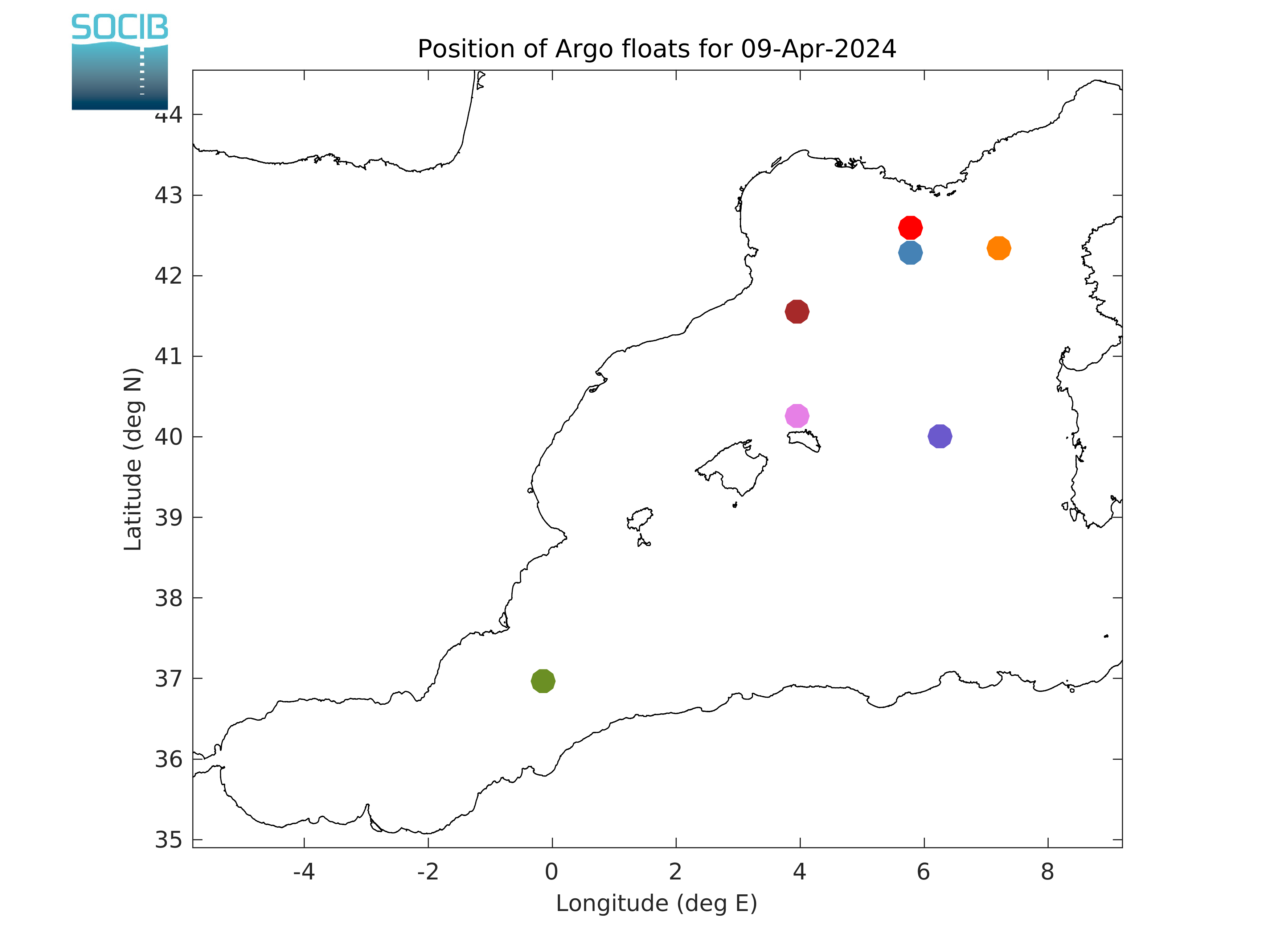
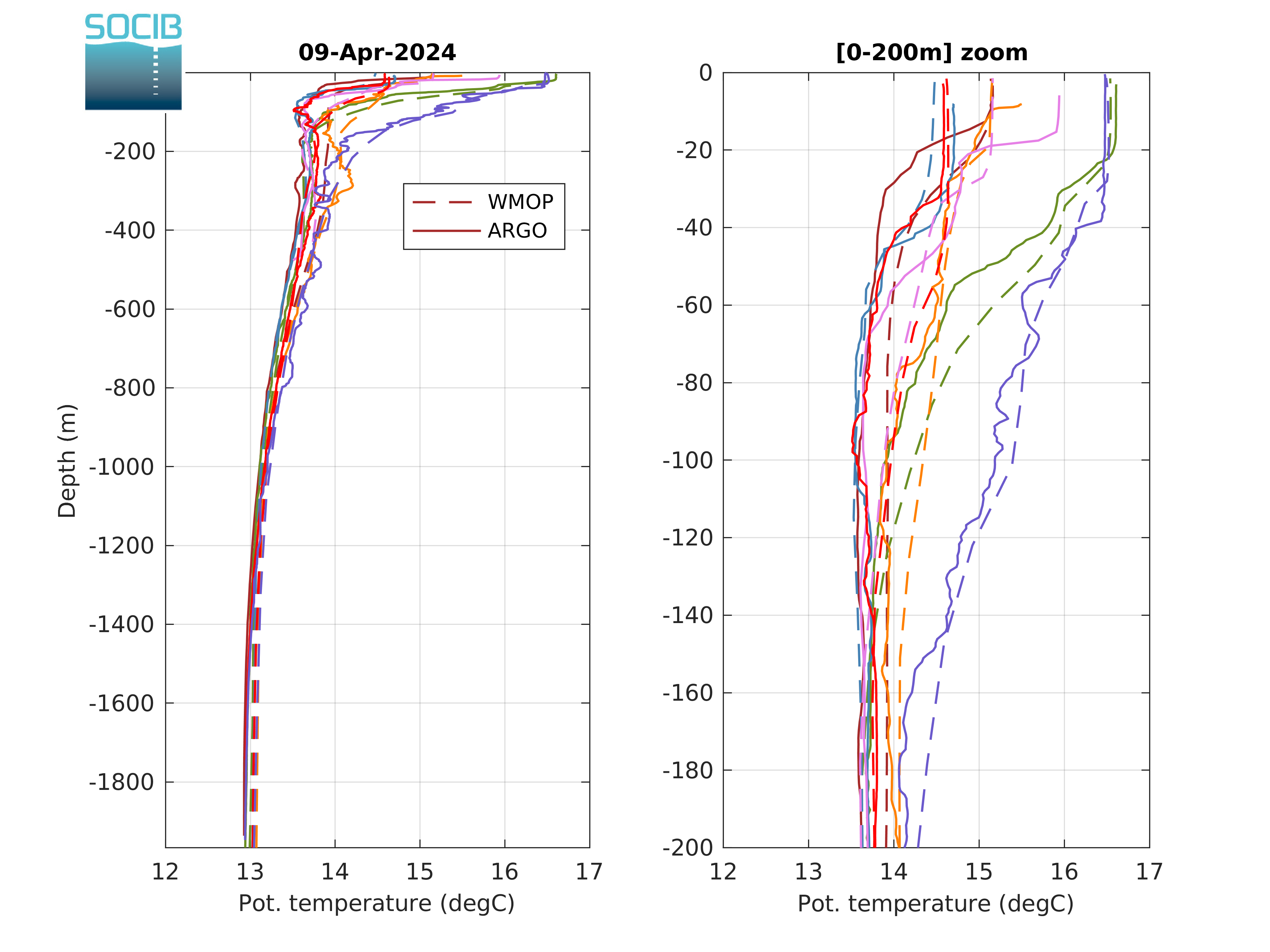
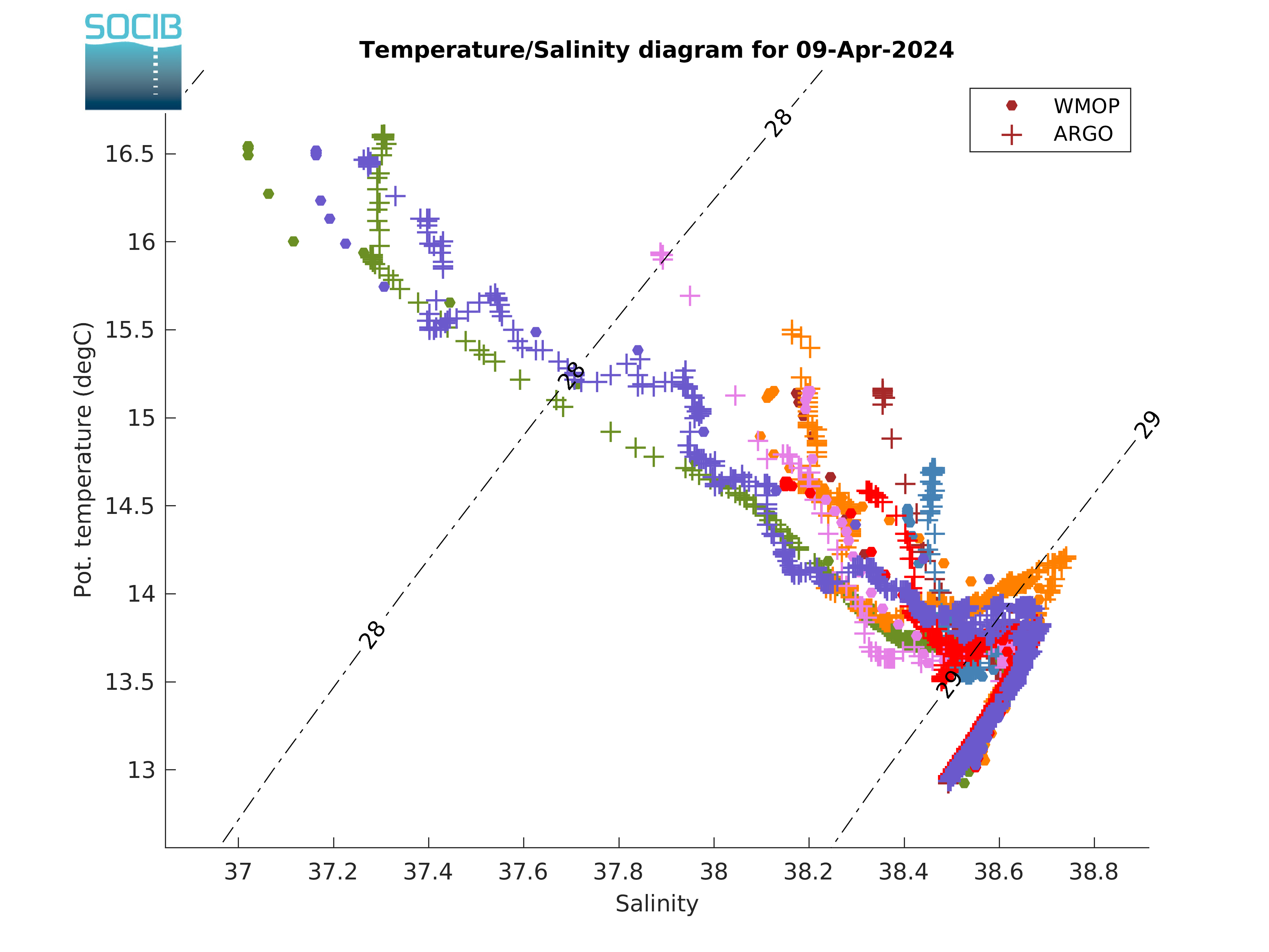
ARGO vertical temperature and salinity profiles
The WMOP vertical temperature and salinity profiles are compared in this section to the last available vertical profiles from Argo floats.
|
||
| Figure 1: Position of last available Argo floats in the Western Mediterranean | ||
|

|
|
| Figure 2: Temperature profiles | Figure 3: Salinity profiles | Figure 4: T/S diagram |
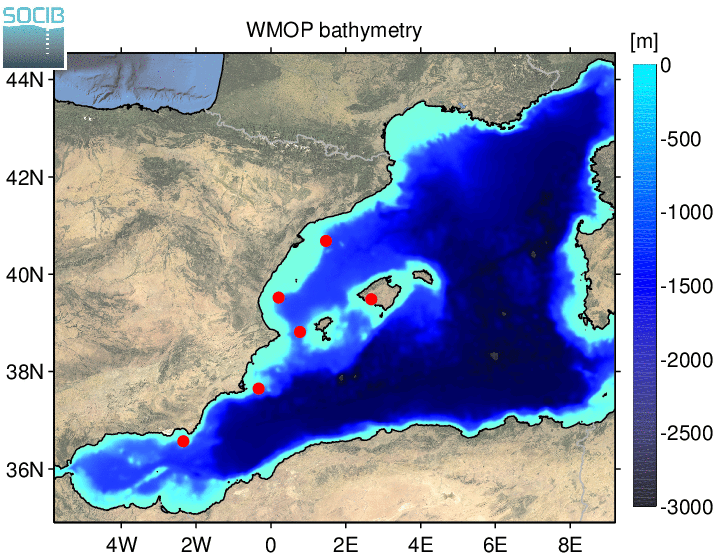
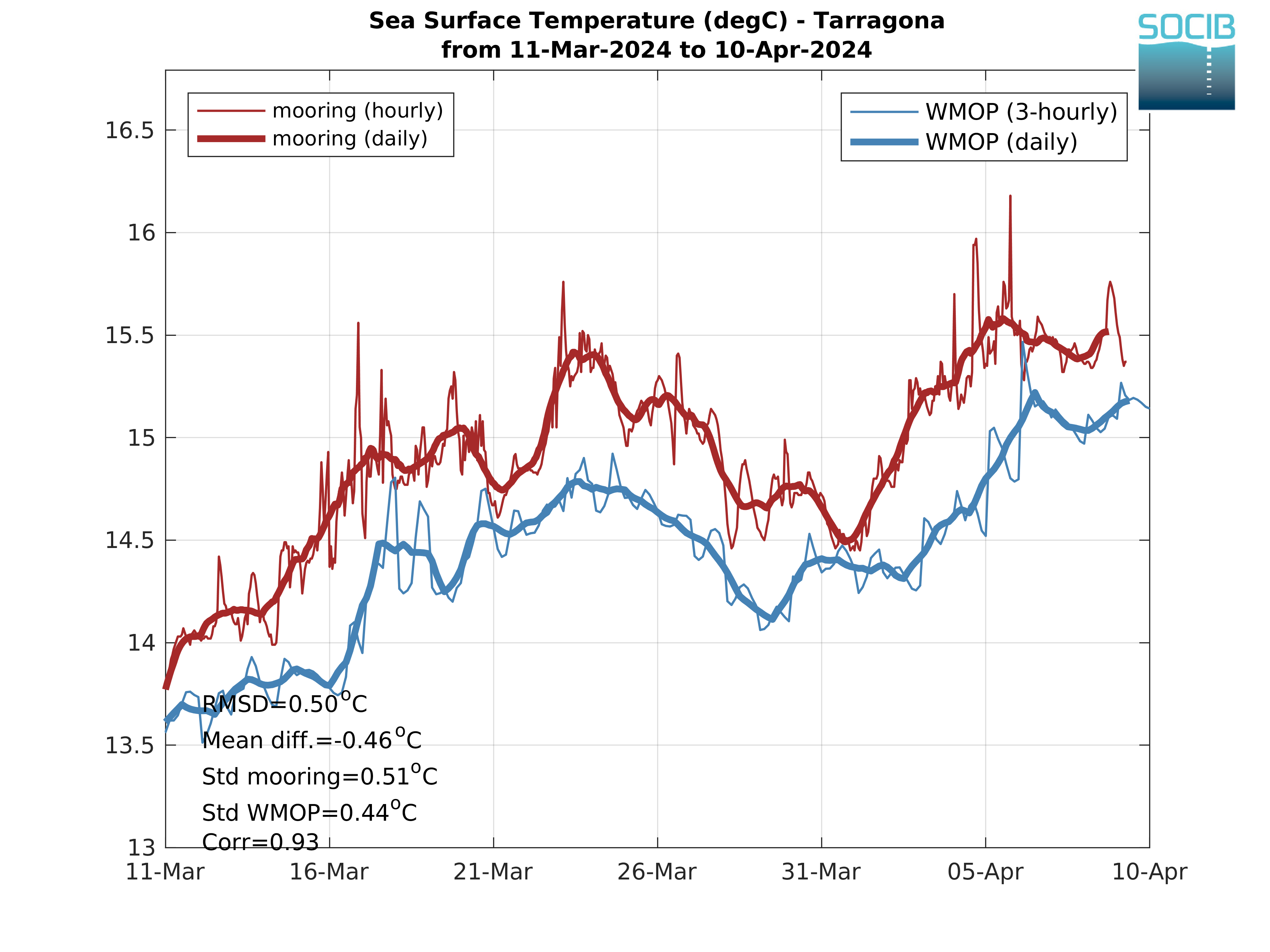
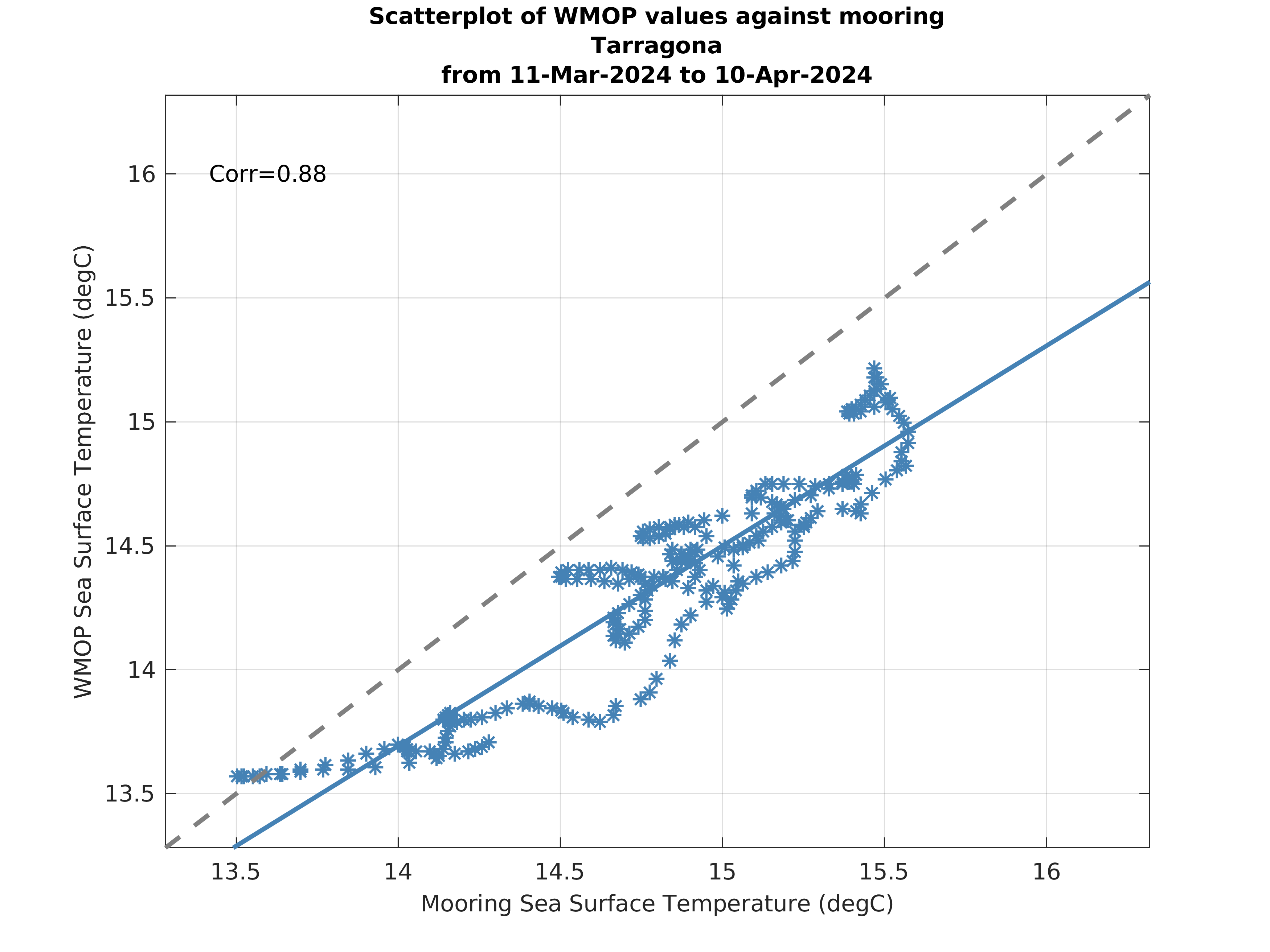
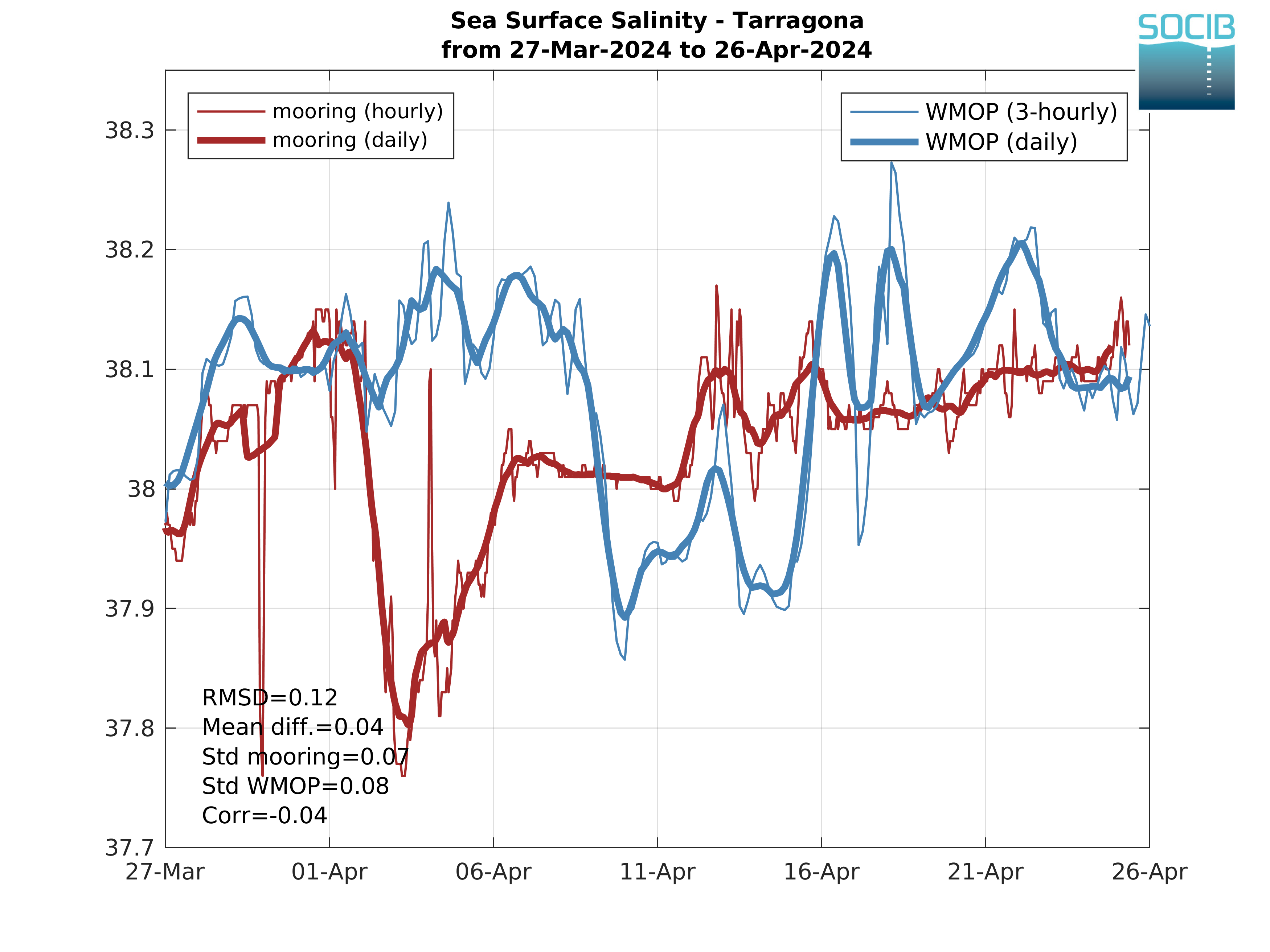
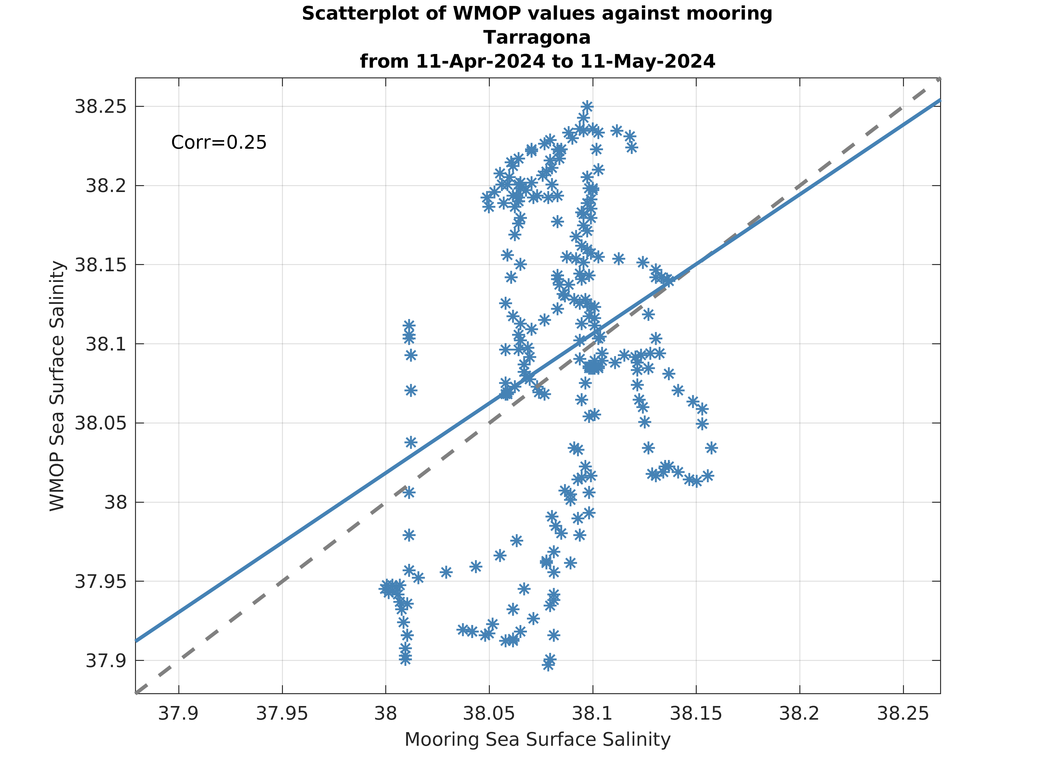
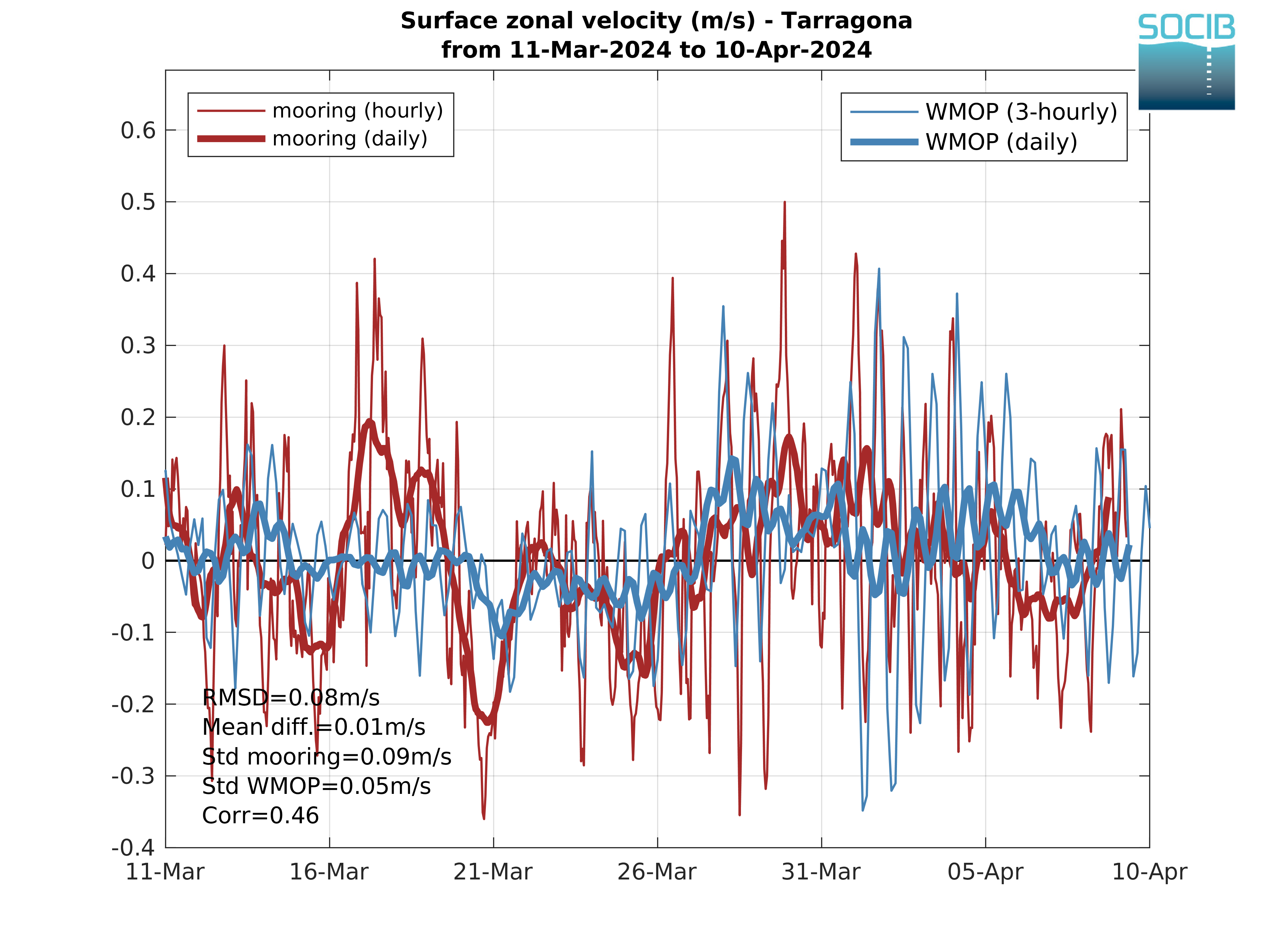
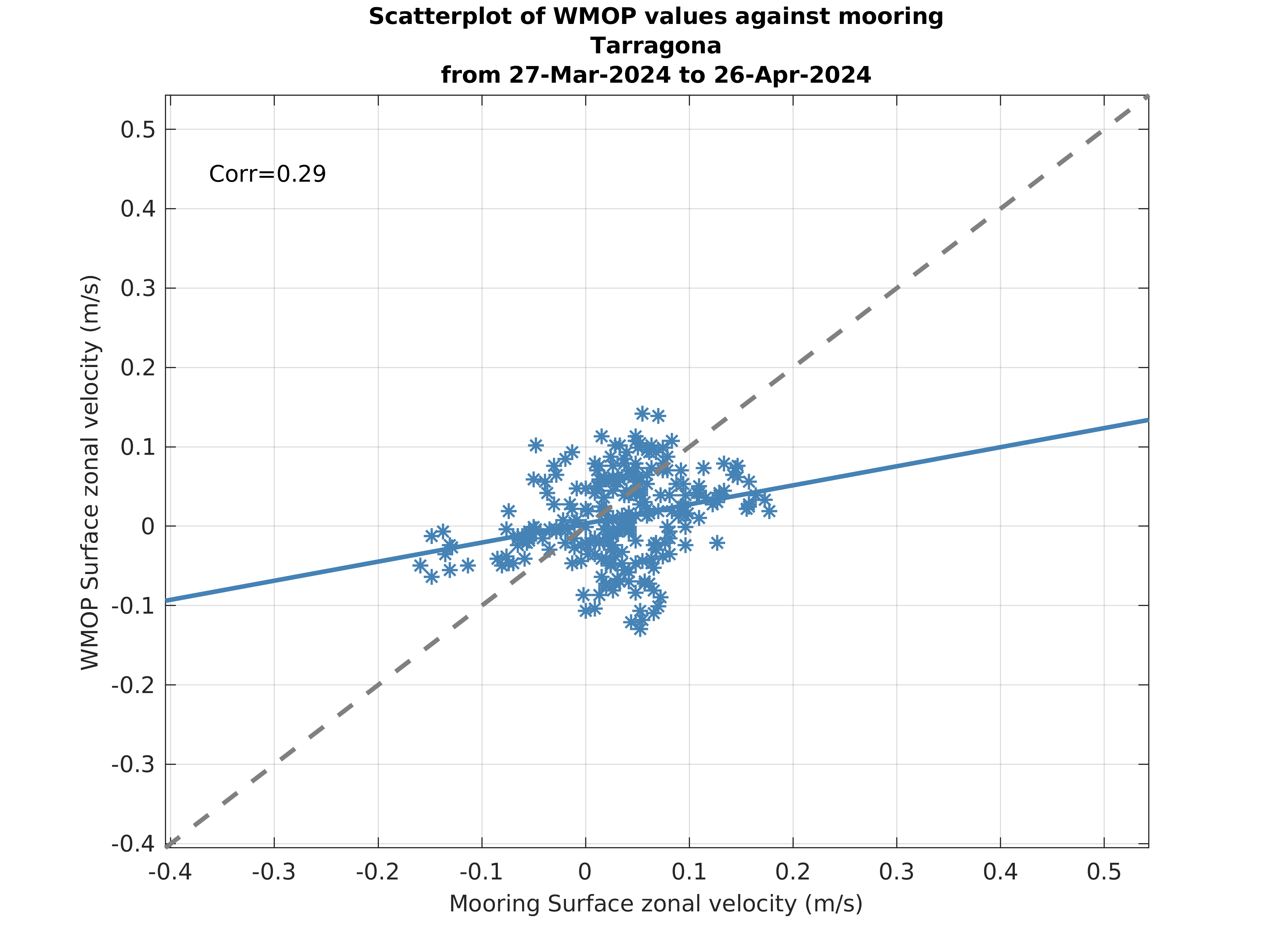
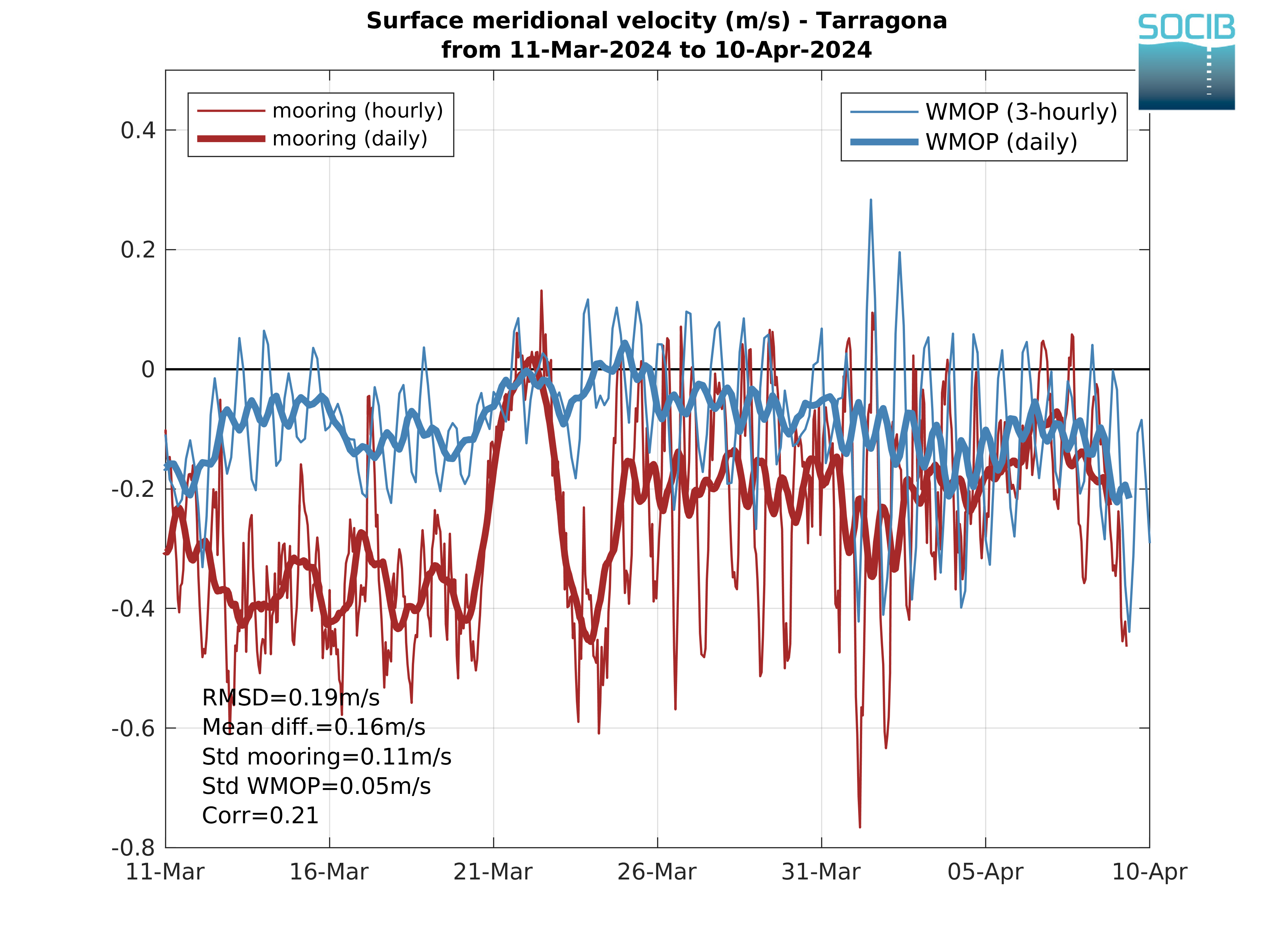
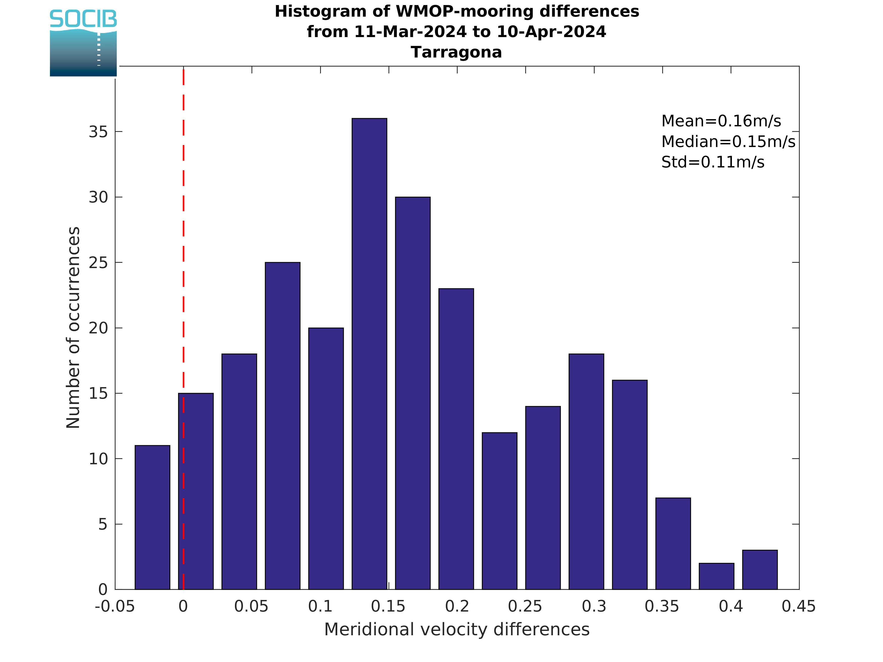
Time series at fixed moorings
The time series of WMOP surface temperature, salinity and currents are compared in this section to available mooring measurements from Puertos del Estado along the Iberian shelf and from SOCIB in Ibiza Channel and Palma Bay.
Select the mooring to be visualized by clicking on its position in Figure 1.
|
|
| Figure 1: Western Mediterranean bathymetry and position of Puertos del Estado and SOCIB fixed moorings (red dots). |
Select the mooring to be visualized by clicking on its position in Figure 1.
Tarragona
| Time Series | Difference histogram | Scatterplots | |
|---|---|---|---|
| Temperature |
|

|
|
| Salinity |
|

|
|
| Zonal current |
|

|
|
| Meridional current |
|
|
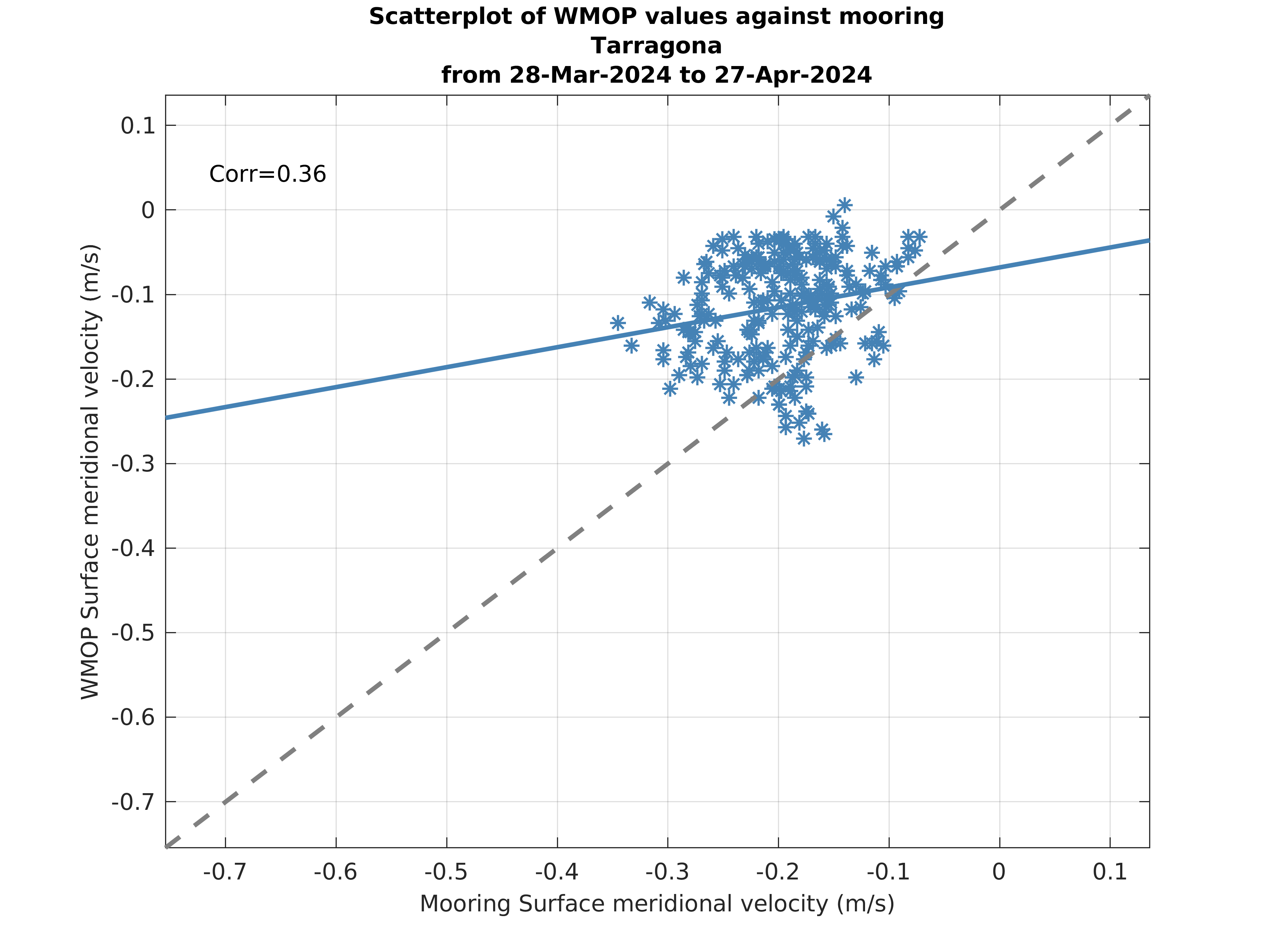
|
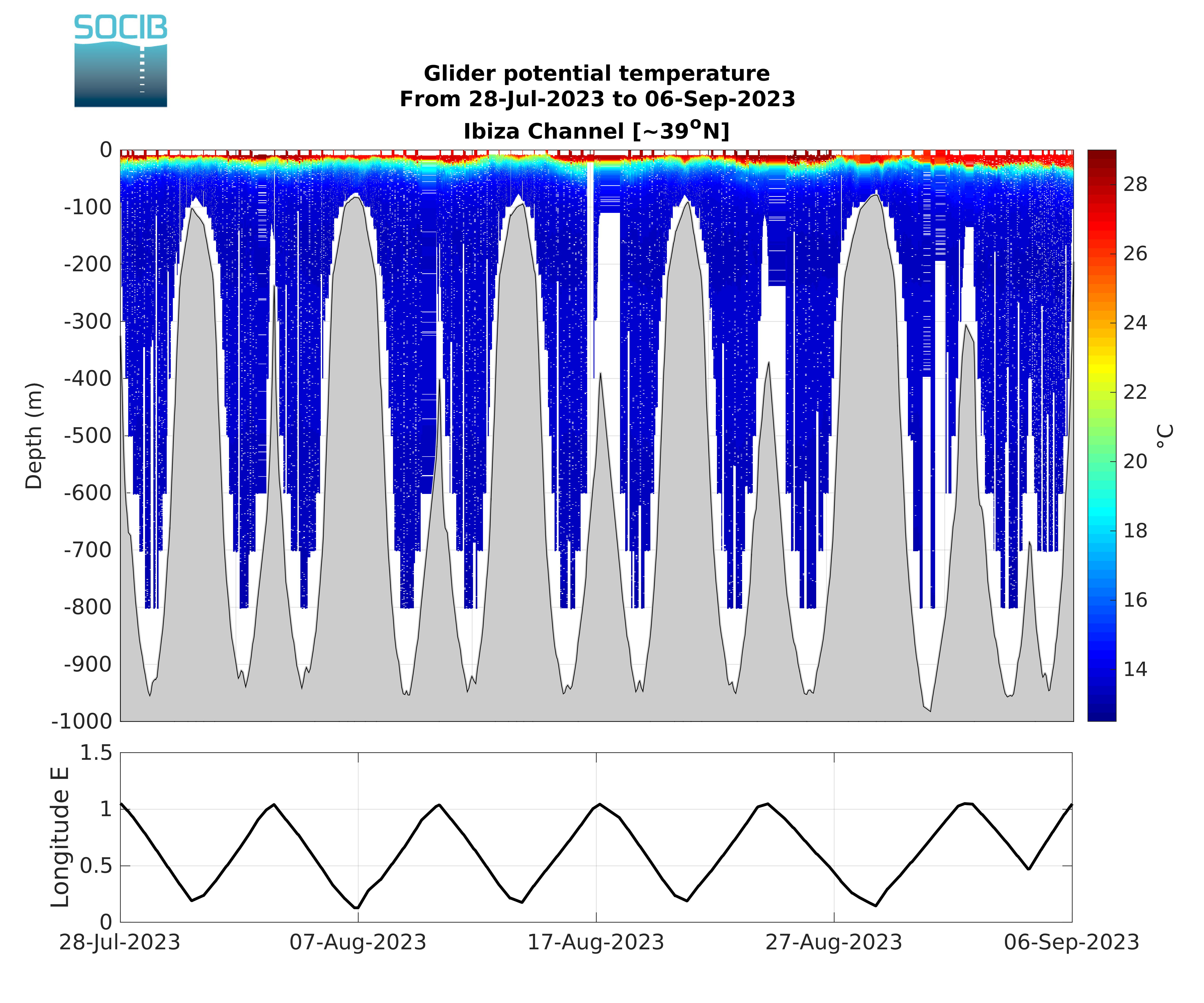
Glider temperature and salinity sections in the Ibiza Channel
WMOP potential temperature and salinity are compared in this section to SOCIB glider data (L2 product) in the Ibiza Channel in near real-time (NRT) for the last available transect as well as in delayed-time (DT) for all the transects of the last mission once finished and available.
Last transect (NRT)
T/S diagrams (DT)
Typical water masses of the western Mediterranean Sea can be identified: Atlantic Water (AW), Winter Intermediate Water (WIW), Levantine Intermediate Water (LIW) and Western Mediterranean Deep Water (DW).
Vertical temperature section (DT)
Vertical salinity section (DT)
Vertical profiles of statistics and skill metrics (DT)
Vertical profiles of statistics and model skill metrics are provided: mean, standard deviation, root-mean-square error (RMSE), mean error (ME) and centered root-mean-square error (CRMSE).
Last transect (NRT)
|
|
|
|
|
| Figure 1: Vertical potential temperature section from glider. | Figure 2: Vertical potential temperature section from WMOP. | Figure 3: Vertical section of potential temperature differences (WMOP minus glider). |
|
|
|
|
|
| Figure 4: Vertical salinity section from glider. | Figure 5: Vertical salinity section from WMOP. | Figure 6: Vertical section of salinity differences (WMOP minus glider). |
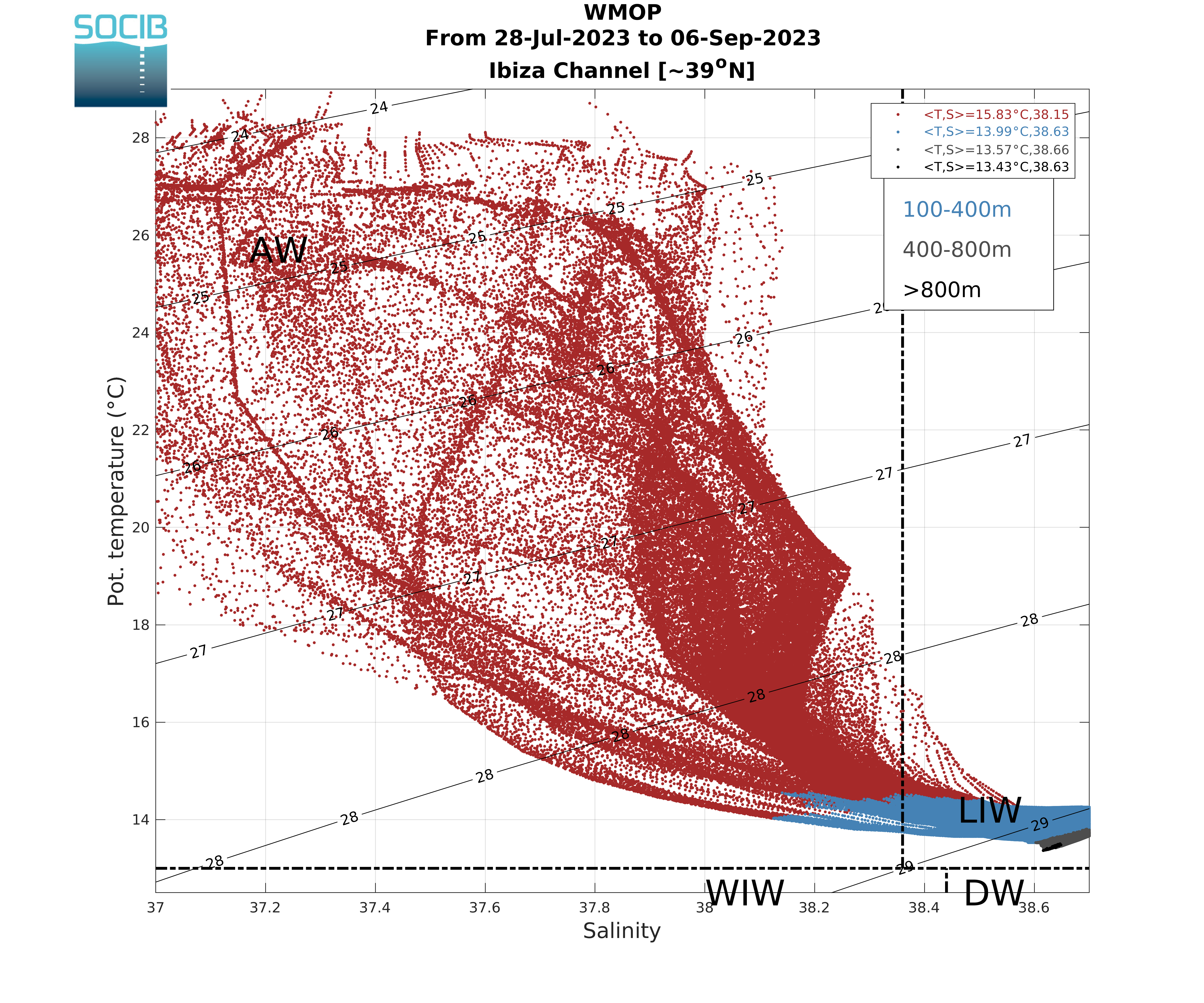
T/S diagrams (DT)
Typical water masses of the western Mediterranean Sea can be identified: Atlantic Water (AW), Winter Intermediate Water (WIW), Levantine Intermediate Water (LIW) and Western Mediterranean Deep Water (DW).
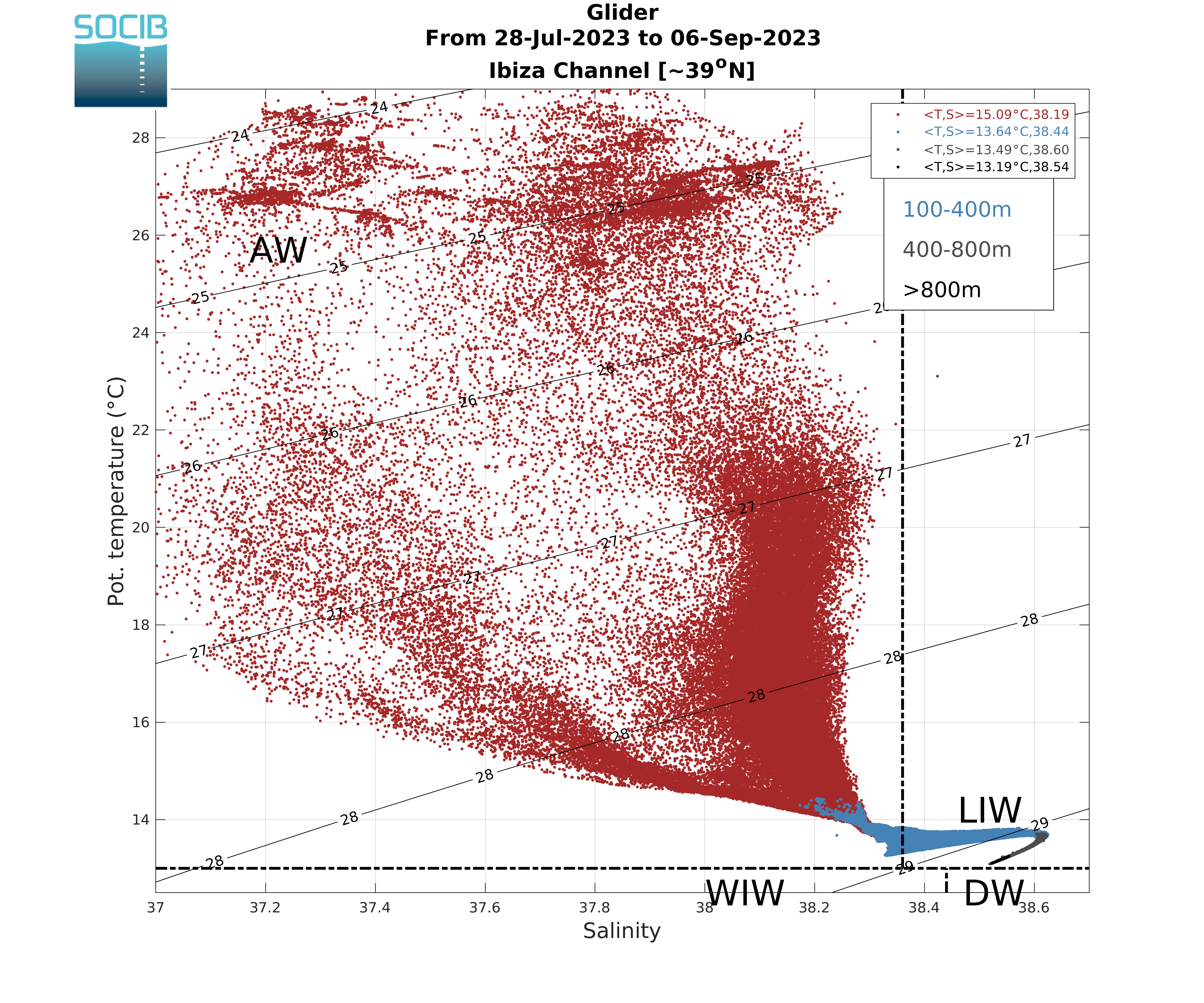
|
|
|
Figure 7: T/S diagram from glider. Medians of the T and S distributions are indicated for different vertical layers. |
Figure 8: T/S diagram from WMOP. Medians of the T and S distributions are indicated for different vertical layers. |
Vertical temperature section (DT)
|
|
|
|
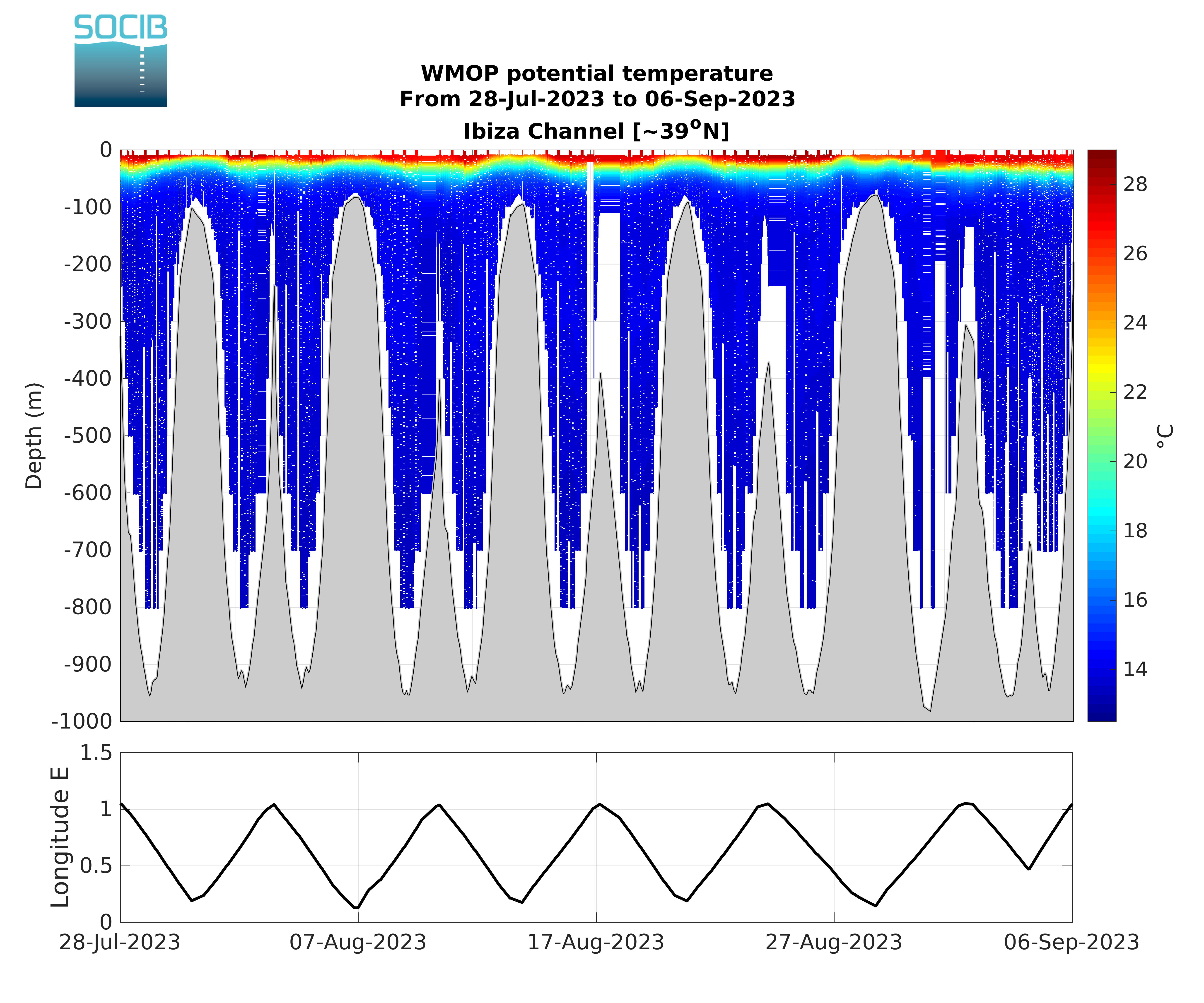
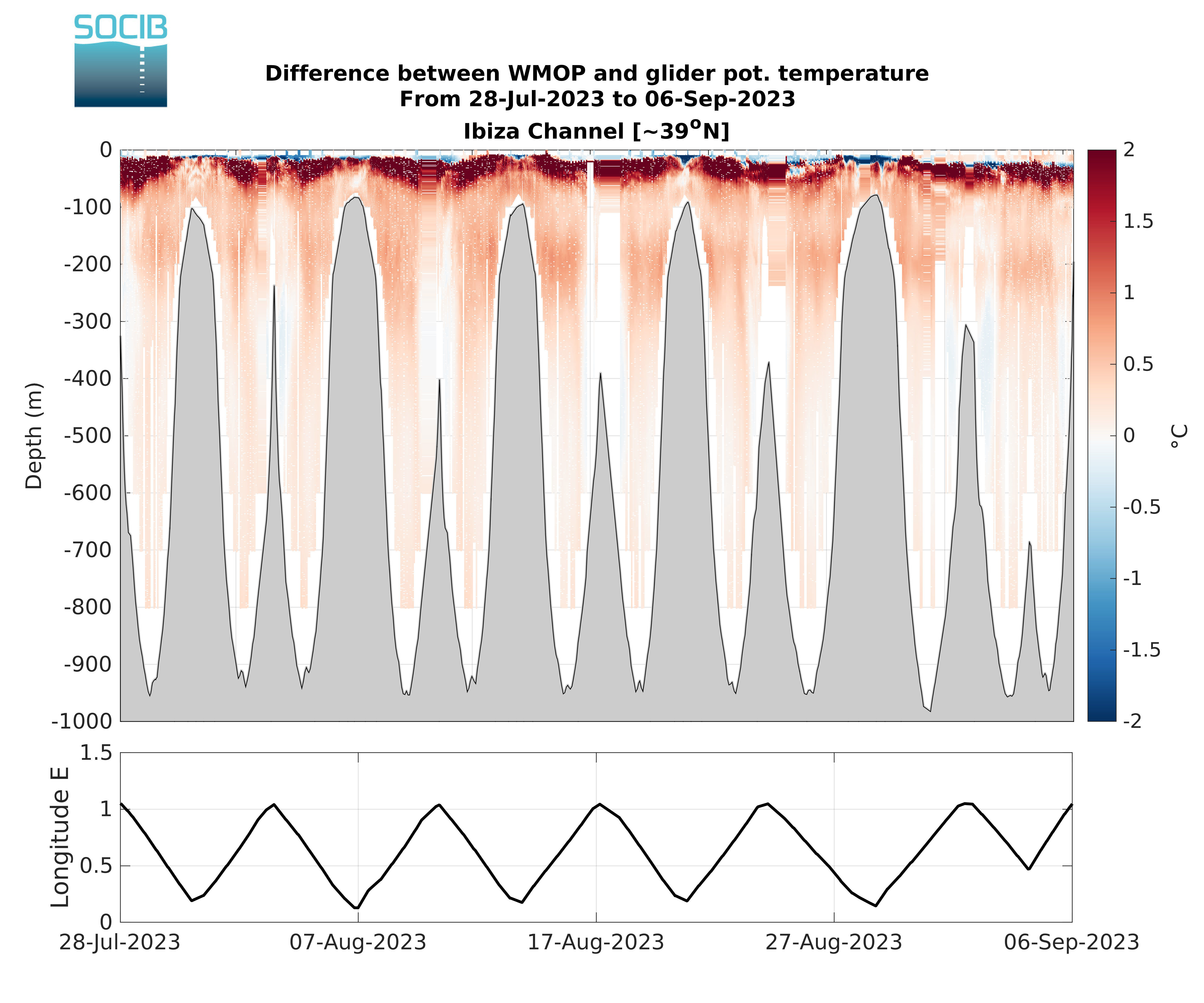
| Figure 9: Vertical potential temperature sections from glider. | Figure 10: Vertical potential temperature sections from WMOP. | Figure 11: Vertical sections of potential temperature differences (WMOP minus glider). |
Vertical salinity section (DT)
|
|

|
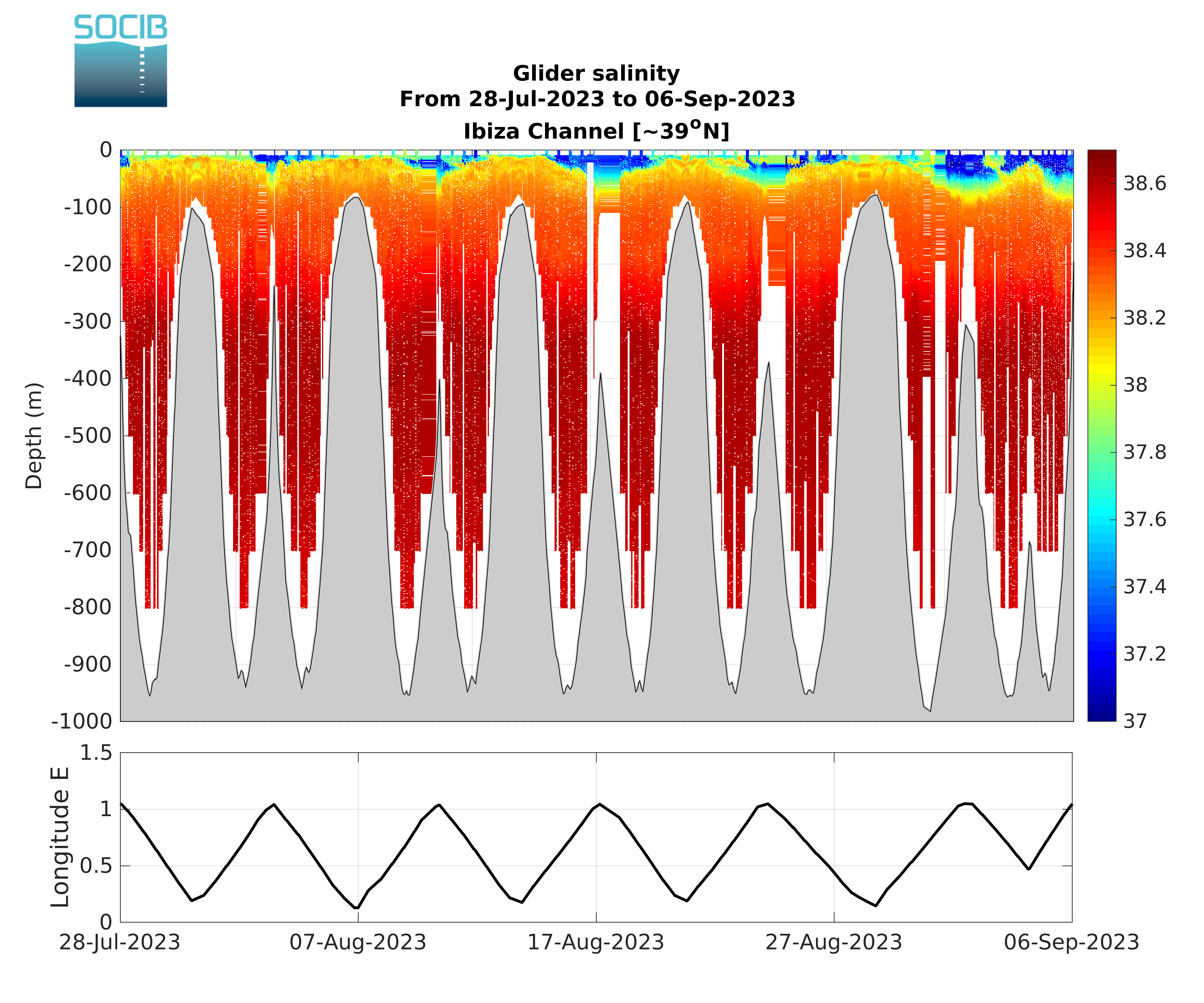
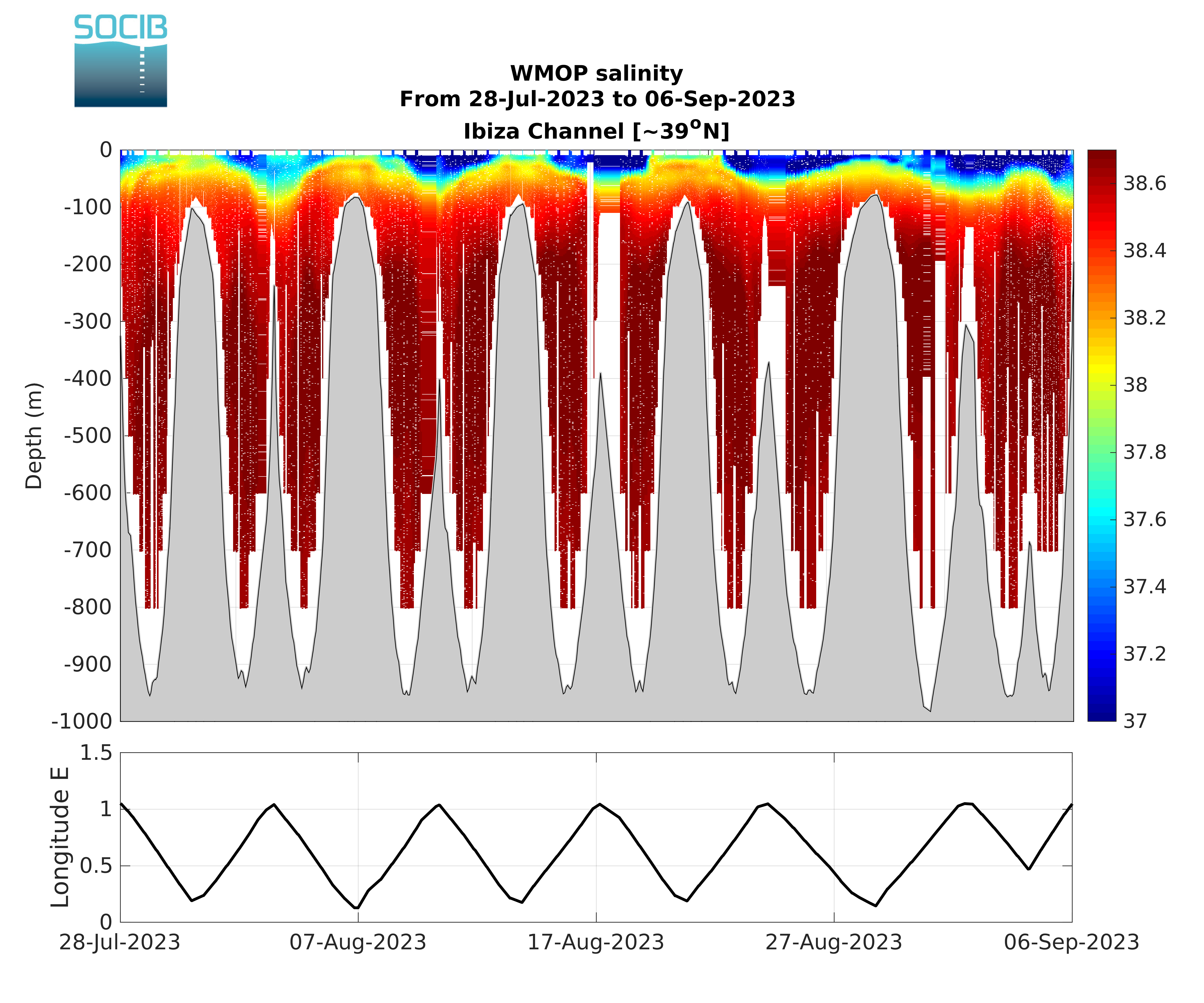
| Figure 12: Vertical salinity sections from glider. | Figure 13: Vertical salinity sections from WMOP. | Figure 14: Vertical sections of salinity differences (WMOP minus glider). |
Vertical profiles of statistics and skill metrics (DT)
Vertical profiles of statistics and model skill metrics are provided: mean, standard deviation, root-mean-square error (RMSE), mean error (ME) and centered root-mean-square error (CRMSE).

|

|
| Figure 15: Vertical profiles of potential temperature mean and standard deviation from glider and WMOP (left); model potential temperature skill metrics (right). | Figure 16: Vertical profiles of salinity mean and standard deviation from glider and WMOP (left); model salinity skill metrics (right). |
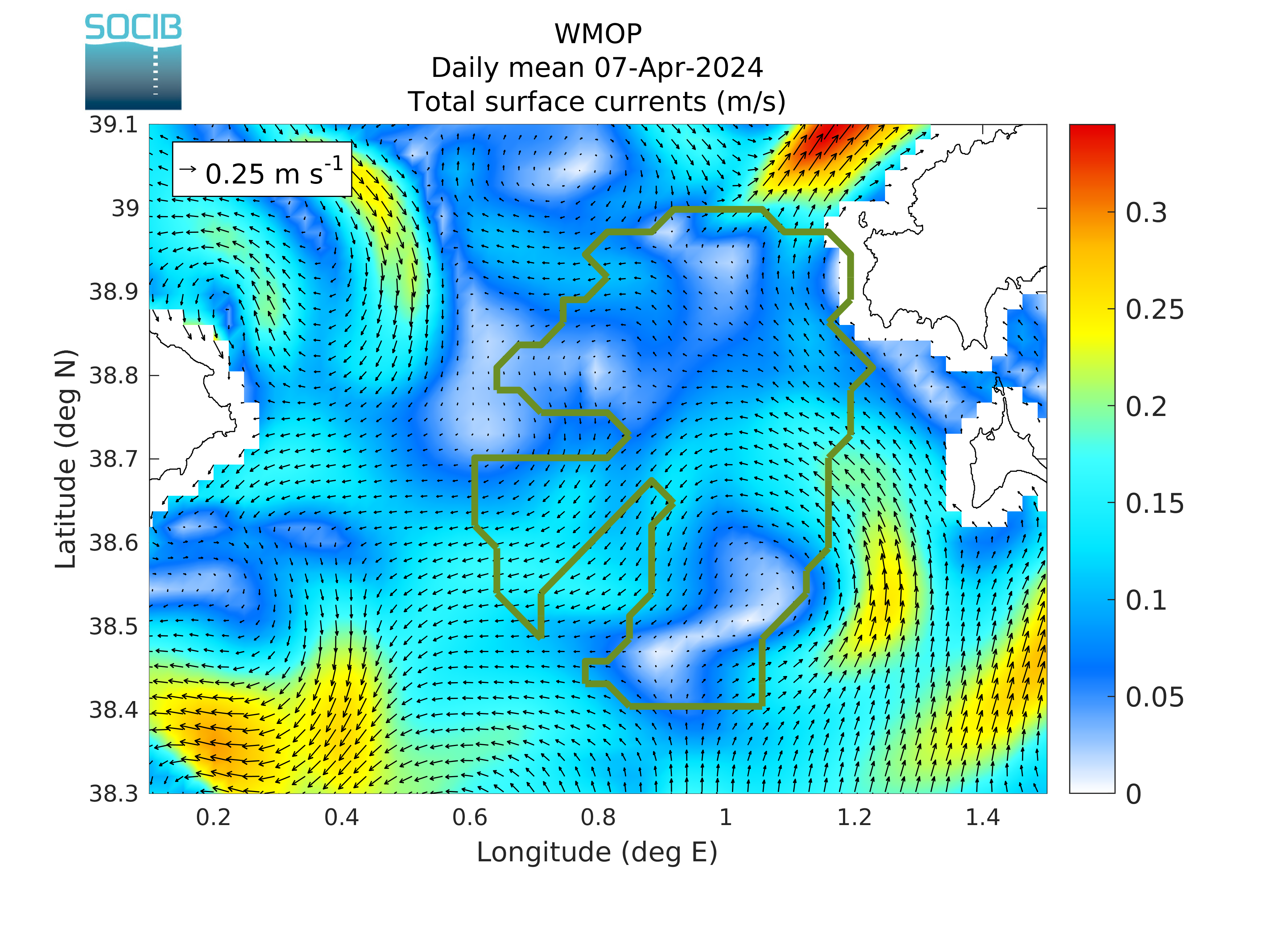
Daily HF radar surface current maps
The WMOP daily averaged surface currents are compared in this section to the last available daily averaged surface currents measured from SOCIB and Puertos del Estado HF radar located in the Ibiza Channel, Ebro delta region and Straif of Gibraltar.
Ibiza Channel
Ebro Delta
Strait of Gibraltar
Ibiza Channel

|
|
| Figure 1: Daily averaged HF radar surface currents (m/s) in the Ibiza Channel. |
Figure 2: Daily averaged WMOP surface currents (m/s) in the Ibiza Channel. |
Ebro Delta

|

|
| Figure 3: Daily averaged HF radar surface currents (m/s) in the Ebro Delta region. |
Figure 4: Daily averaged WMOP surface currents (m/s) in the Ebro Delta region. |
Strait of Gibraltar
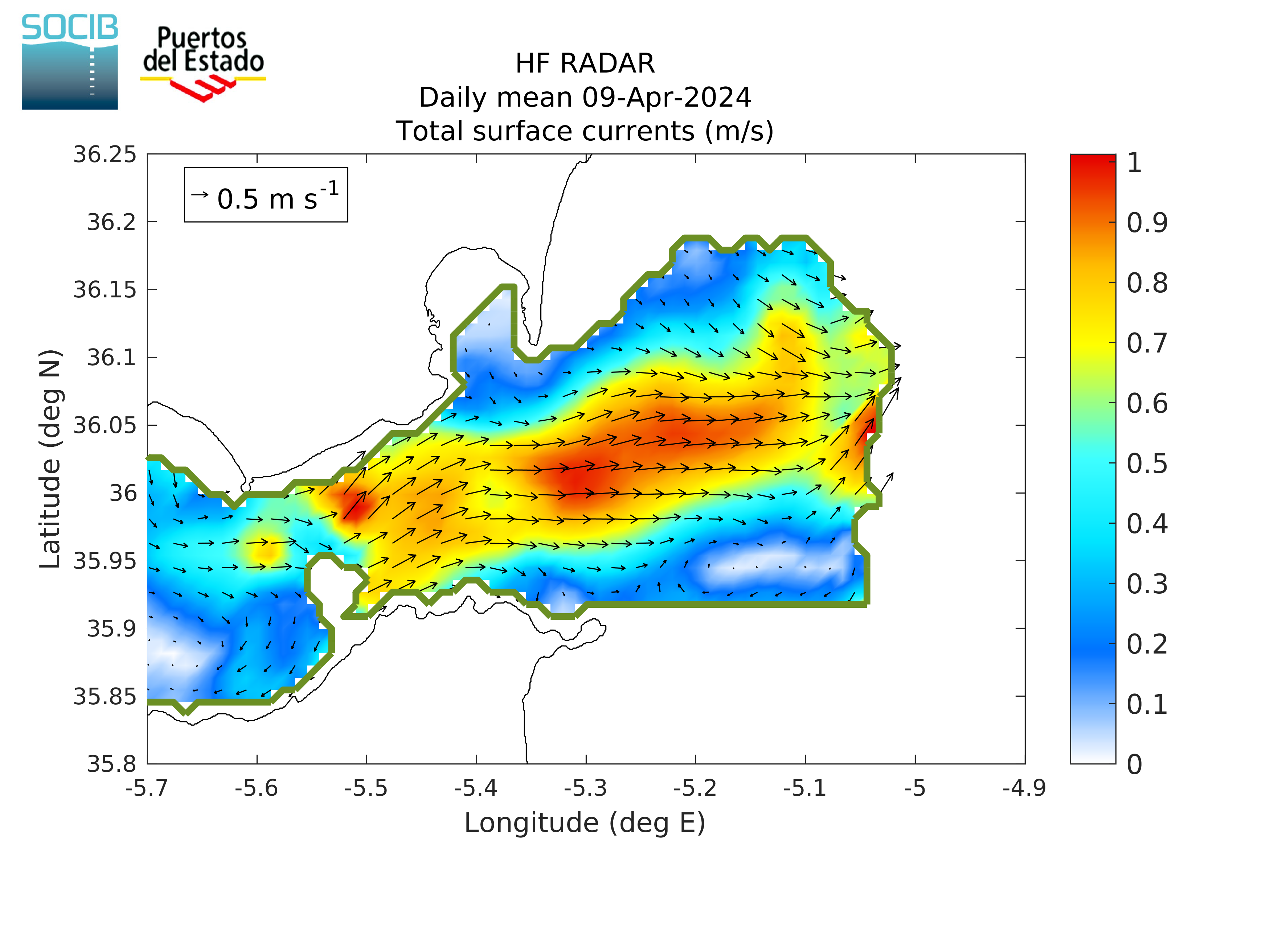
|
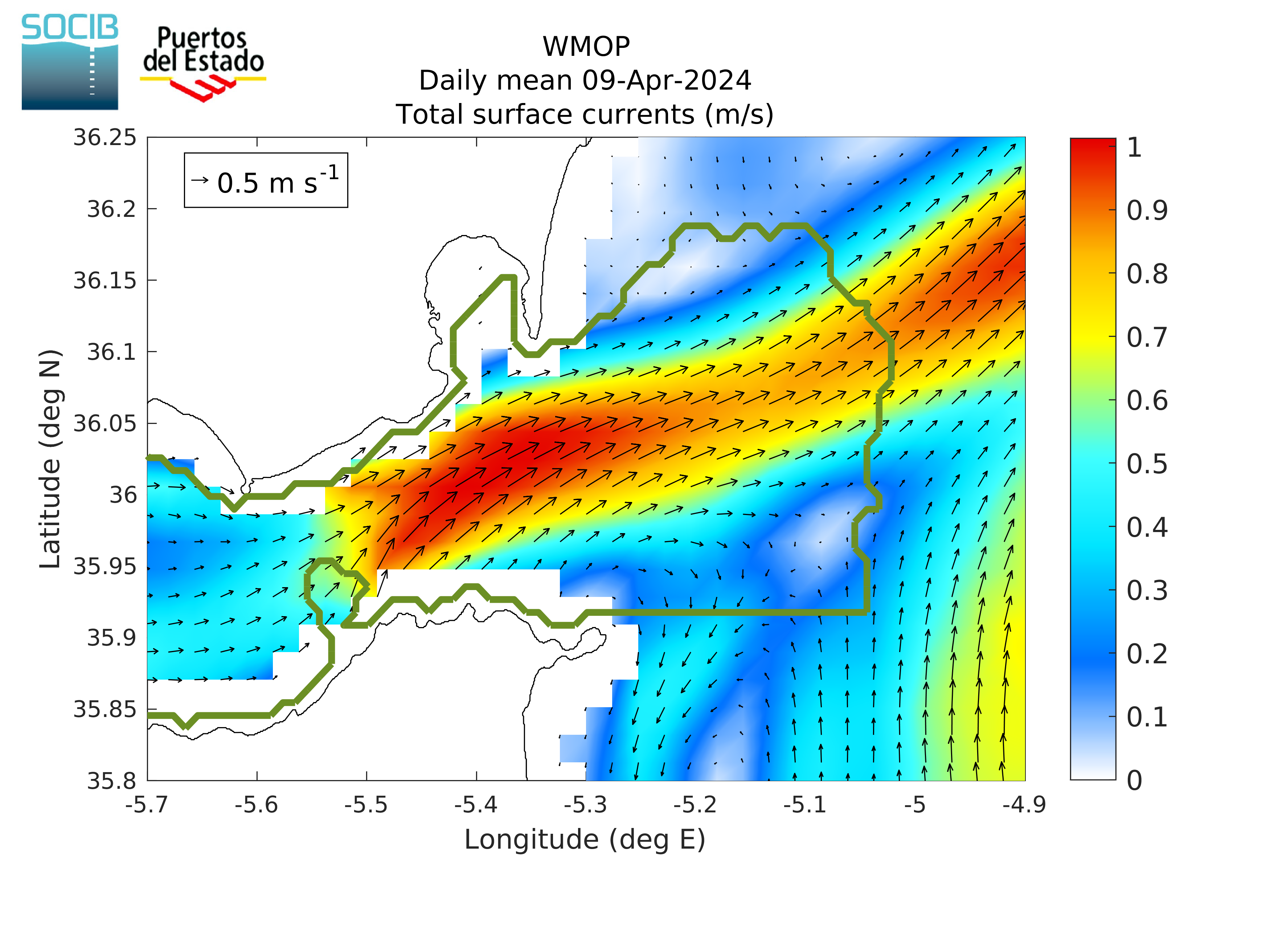
|
| Figure 5: Daily averaged HF radar surface currents (m/s) in the Strait of Gibraltar. |
Figure 6: Daily averaged WMOP surface currents (m/s) in the Strait of Gibraltar. |
